
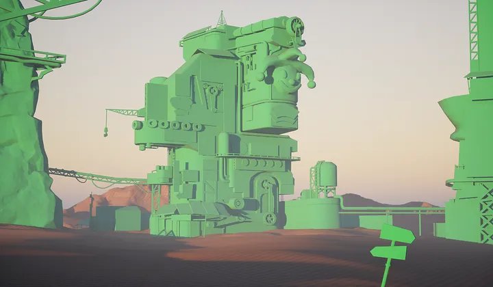
Clown Town

Clown Town is my First environment in UE5 and one of my larger scale environments since graduating. Concept by SY-37 on Artstation.
Clown Town


When choosing my concept I made sure to consider how long it would take me and how many assets I would need to produce. Making the assets would definitely be to longer part and I didn’t want to over extend myself making dozens of props that would likely burn me out. By choosing a concept that went above my previous whilst also within a reasonable time frame I knew that I could create an interesting rendition.
Happy with the concept I began breaking down the concept into its forms, deciding what would be modular, atlas, trim sheet or bespoke. By doing this I found it much easier to digest the concept and plan each part in a manor that would allow me to work as effectively as possible. In the end some of these did actually change from trim to bespoke and vice versa as well as, ending up not using RVT due to some tech issues but overall breaking down a concept like this allows me to work efficiently.

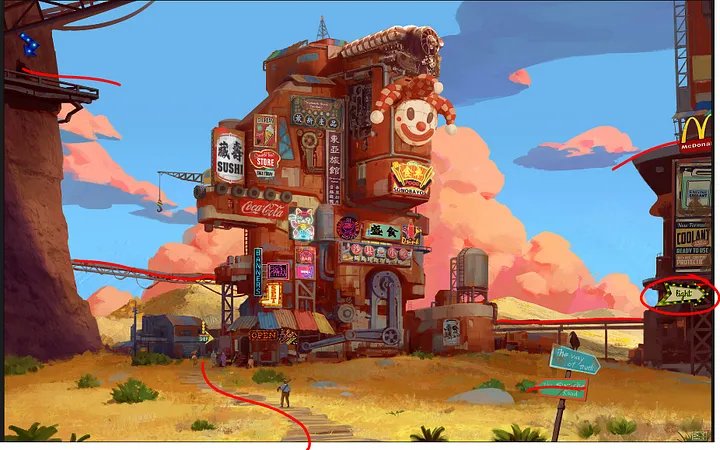
Having broken down the concept I then set off finding references for quality i wanted to achieve, art style and examples of materials and shapes. Doing so allowed me to get a better understanding of what I wanted to achieve and aided in ensuring my quality didn’t drop. A big inspiration for me was Overwatch, particularly the map Junker Town. The concept shared a lot of similarities with the map so I found walking around the map in game as an effective way for me to find good references as well as, helping set the scale for props and textures.

Blockout
For my blockout I first started by getting my main shapes in, so in this instance it was the cliff, main shape of the centre building and the tower to the right. Doing so allowed me to better frame my shot and made it easier to continue filling the scene. Additionally, wanting to be as accurate as possible I used this tutorial by Lucas Annunziata which made it so I could overlay the original concept over my scene using a post processing material and camera. This let me match the composition and set up the main camera shot early into the project.
I started by blocking out my smaller assets. I like to create early versions of my assets that have the general shape and form of my final models but without the major details. I ensure these are scaled correctly and I fill out the scene with them. The main portion I wanted to fill out was the building as it contained the most detail and by filling it out early I would be able to come back to it at a later date.

I continued to populate my scene and with the added help of the overlay of the concept it was easy to line everything up to match the concept. I would blockout in Maya and then export into UE5. With the main building after producing the main shape I would then add the extra parts in maya and reimport the same model in Unreal which would allow me to update the model without having to manually place the pieces again. Furthermore, adding the props to the main building was easier in Maya as everything was forward facing meaning unlike my scene the axis for a majority of parts had yet to be rotated.
One part of the concept that I really liked and was careful to push was the use of leading lines in the composition. All the lines point toward the building, and it makes the composition very striking. I actually ended up flipping the light arrow sign around for this reason as I wanted it to guide the viewer towards the build rather than drawing away.
Modeling
I knew for this project that I’d be using Subd, trims and mod kits for a majority of the prop work, this meant that I’d only have a select few models that required a high poly sculpt. For the models that didn’t require a high poly my basic approach was:
Blockout in maya and place into scene, then refine the blockout into the low poly, adding in edge loops and bevels to smooth out sharp edges that would appear noisy at longer distances. Then I would add some extra topo to areas such as the main body of the building, this would allow me to vertex paint with more precise strokes further into the process. For the pipes and scaffolding those were mod kits using a trim sheet meaning that I wouldn’t pre place them in scene but rather model them all and unwrap them, overlaying them on a trim sheet made for my metal work and tyre’s.

This is the same process I used for the majority of the props with a few outliers being the clown, the cliff and the roof engine.
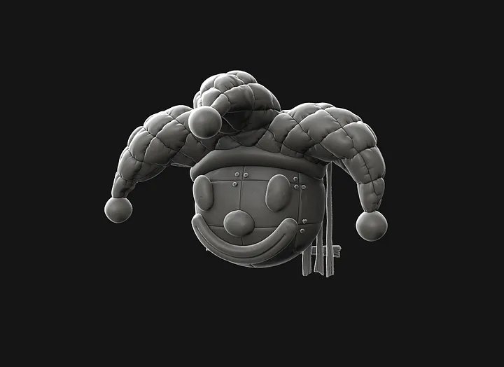
For the clown I first started with a blockout in Maya, I then exported and place it in my scene; making it easy to reimport later. I then exported into Z brush and sculpted in my details, using an alpha mask and inflate to create the pattern on the hat. I also sculpted several wooden planks for the backboard. Sculpting only a few meant that I could save uv space and time by duplicating and moving some of these wooden boards. After sculpting I decimated and exported back into maya. I then had to retopologise the clown which was difficult due to the unique shape of the hat, trying to create a shape that would conform to the hat whilst also remaining low poly was a challenge but the pay off was worth it.
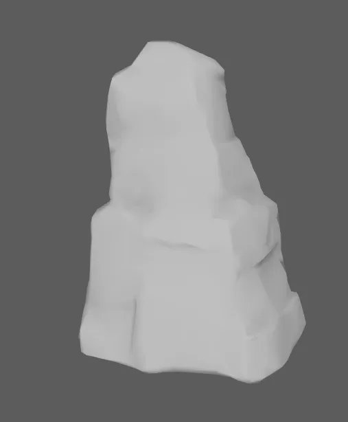
The next challenge was the cliff, originally I wanted to match a more overwatch style and I looked into how their cliffs looked in game. However, this drifted too far from the original concept and upon further iterations I ended up leaning more towards the colours and style in the concept. To make the cliff I made a blockout in Maya and exported into Z brush where I sculpted using brushes such as Flatten Edge, Trim dynamic, Trim Smooth Border and H Polish. Happy with my sculpt I exported back into Maya and used a decimated version of the cliff as my low poly, using camera based unwrap to help make unwrapping the cliff much easier. As previously mentioned there was much back and forth with the cliff as I was trying to match the light angle in the concept in the end I managed to achieve a result I was happy with.
The last prop was the roof engine, making this piece was a challenge but a fun one at that. In the concept the shape is quite hard to read so with this prop a lot was trial and error seeing what kind of metal work I could attach to it to achieve my desired effect. I once again started In Maya blocking out my shape. I then however, used subd modelling to create my high poly rather than going into Z brush. I chose to do this as the engine was all hard surface and I felt using subd would provide me with better results. In addition, I created some simple greebles that I would then later add to the model once baked and textured, these would allow me to fill empty space around the model whilst also matching the concept by having these more crowded locations on the prop.

Texturing
I textured the majority of my assets in Substance Painter with a few notable exceptions being the billboards in Photoshop and some tiling materials in Substance Designer.
I wanted to keep my textures simple whilst also appearing somewhat painterly.
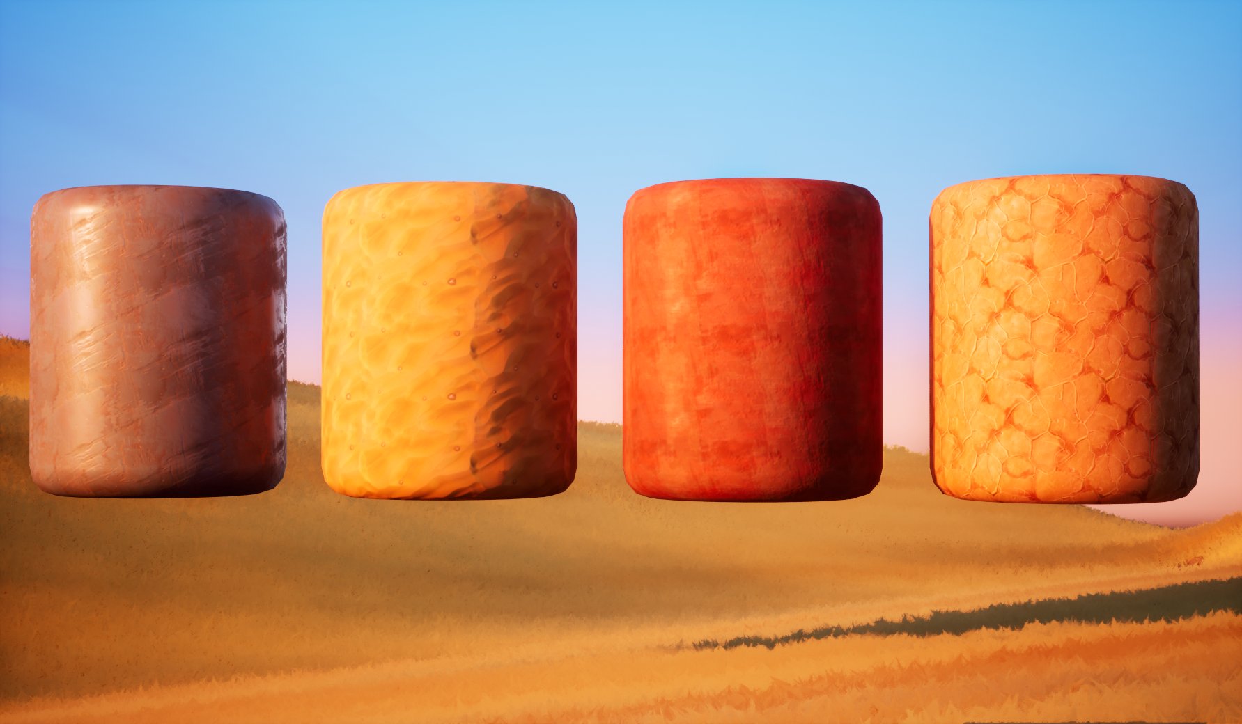
Here is a breakdown of the texturing for a portion of the clown, the rest of my assets textured in Painter follow the same approach with minor tweaks depending on the material.
I would first start with a base colour, I would then apply a lighter colour using grunges to build up some colour variation. I used these in conjunction with fill layers as it make it easier to tweak the colours and to add masks where necessary. I would then use a poistion generator to add light to areas I wanted to highlight on the model. Another generator was used to add a slight shadow to help contrast the highlights. The last colour addition was in adding some slight AO to the crevices of the prop.
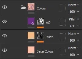
I would then, in a separate folder add a fill layer for a base roughness, add another layer using masks to create some roughness variation and to finish it off I would also add some AO into the roughness to help push highlights into the correct areas.

For my tiling materials they were all produced in Substance Designer. I always found Designer challenging and with this project I really wanted to test my self by making several material to use in my project. I experimented a lot and looked into tutorials and downloaded free materials so study how others would use the nodes to create their materials.
I found the best way to create my tilables was to first start with the height map, creating my major shapes first and then adding in smaller details as I went along. Tile Sampler and the Slope Blur Grayscale node were both heavily used in my materials as they allowed for unique shape creation whilst not getting into too realistic details.
With my height map made I would then blend them all together and start working on my other maps. For my gradient map I would plug details from my height map into a blend node, combined with a uniform colour to create colours on specific areas of the material, the same process is used for the metallic and roughness, but rather than blending with colour I would blend with noise and grayscale maps to create those maps.
One key feature in all my materials was using a Normal node to grab specific details from my height map and to then use them to add colour into my gradient map. This would allow me to add shadows inside cracks or add edge highlights along a groove, allowing me to keep the materials stylised with simple colour variation.
Scene Setup
When setting up my camera shot I quickly realised how far my camera would be from the main portion of the building. This caused some issues with things looking quite flat as well as, some shadows and fog having a hard time staying consistent.
One work around I found for creating proper atmosphere and preventing flatness was having some props much closer to the camera and ensure there was good spacing between foreground, midground and background pieces. This helped to keep the contrast between the props high without losing the atmosphere I had built.
One portion of this scene I had fun working on was the clouds. Originally, I had planned to create a sky sphere and use that to have rolling clouds. But in the end I found using alpha cards would give me an effect more accurate to the concept whilst also allowing me to further push my hand painting skills. To make them I used photoshop and used a brush similar to what was used in the concept to give me these patches of colour that I cloud easily blend with one another. Using alpha cards also meant that I wouldn’t need to paint the entirety of each cloud but rather the portion I knew would be visible in all my camera shots.
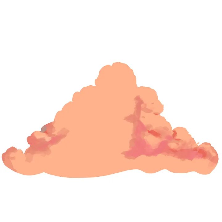
Furthermore, in my material set up I included several parameters that would allow me further control over the colours and values of the cloud. This was valuable in particular because as my lighting direction and colours changed my clouds also did. So by having these controls I was able to consistently tweak my clouds when need be. Another parameter included was Temporal AA which added dithering to the edges of my clouds, this removed their hard edge and soften them.

Another important portion of my scene set up was my neon signs and adding interval flickers into them. I experimented with a few different ideas using frac and sine nodes to try and create the flickering but thanks to Santeri Soininen who suggested a different technique, I was able to create a material that provided much control to the flickers.
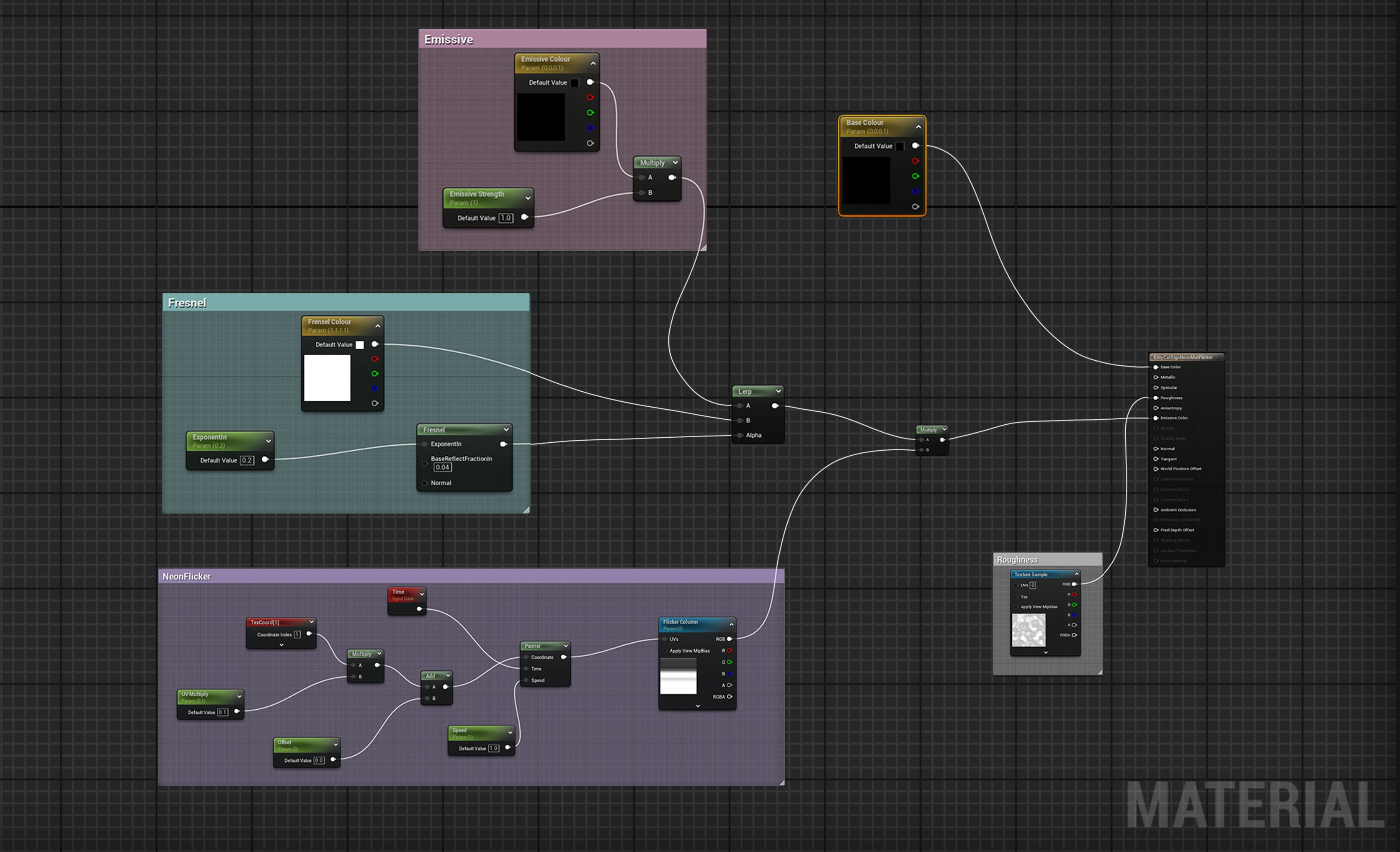
The way this works is by using a 1x128 black and white image over a panner node, you can control the rate and length of the flickers, with the black turning of the light and the white turning it on. By using small intervals of black you can add multiple flickers. In addition, adding extra parameters can allow for controls to speed, flicker offset and the scale of the image. One important note is that when using this a second UV sheet is important as you need to scale all the uvs to 0 for any object that will have this material applied. This ensures that flickers will occur at the same time on multiple meshes.
Lighting & Rendering
Lighting tends to be a weaker area for me so I was very thankful to have my mentors support to help train and guide my eye to push my lighting skills further. Lighting went through several iterations with this scene, with each version improving upon the previous. This project was my first UE5 project and therefore my first time using Lumen. Using Lumen allowed me to push my lighting further with highly accurate dynamic lighting and shadows.
Setting up fog was a big part of this project, I wanted to help break the background and mid ground elements, and by using height fog I was able to create the space needed to create the depth required to prevent the scene from looking flat.
Another big part of lighting was using a light function. The light function I used was introduced to me by Tim Burroughs which allowed me to create a cloud shadow affect over the scene. This in conjunction with my current lighting set up really aided in creating dynamic shadows over the grass field.

The last part of my lighting and rendering set up was my post processing material and my additional lights.
For post processing its main use was to try and match the colours of the concept as well as, adding some own flair of my own. The main parts I adjusted with this were playing with the contrast and gamma of the global settings to make the colours vibrant. A further part I tweaked was the shadows, using contrast to lighten the shadows and using saturation to make my shadows slightly purple. This was to help match the shadows created by the sky light as well, to help create contrast between it and the majority orange scene. For my additional lights I included several different types of lights to further match the concept but to also help to highlight areas of interest.


Directional, PostProcess, Sky Light and additional lights
Conclusion
This project was a fun learning experience. During it’s creation I learnt many different tools to help push my abilities further. I’m grateful for my mentors aid which allowed me to plan this projects development accordingly. This project more than previous was completed thanks to following structure. Blocking out using simple meshes in Maya or Unreal for example. Making sure to match the composition and solving any issues around and in the shot. The earlier on I adjusted things the easier it made it to make adjustments further into the project’s production. The biggest mistake I’ve made before is over committing to certain props, following my structure and working loosely allowed rectifying mistakes to be easily done.
I am super grateful to all those that helped me during the course of this project. Another thank you to my fellow mentees. And those from The Club and Experience Points were always super supportive.
Once again a big thank you to all those that helped:
Alice Hughes — My Amazing Mentor!
Josh Donaldson — Created the cute little bird on my sign post!
Tim Burroughs — Helped me with my lighting and my light function!
Santeri Soininen — Helped me to create my neon sign flicker material!


Comments (4)