
Some projects I'm proud of.
I uploaded a couple of projects from the past year that I would like to share. These were mainly done as part of my studies at CDW.
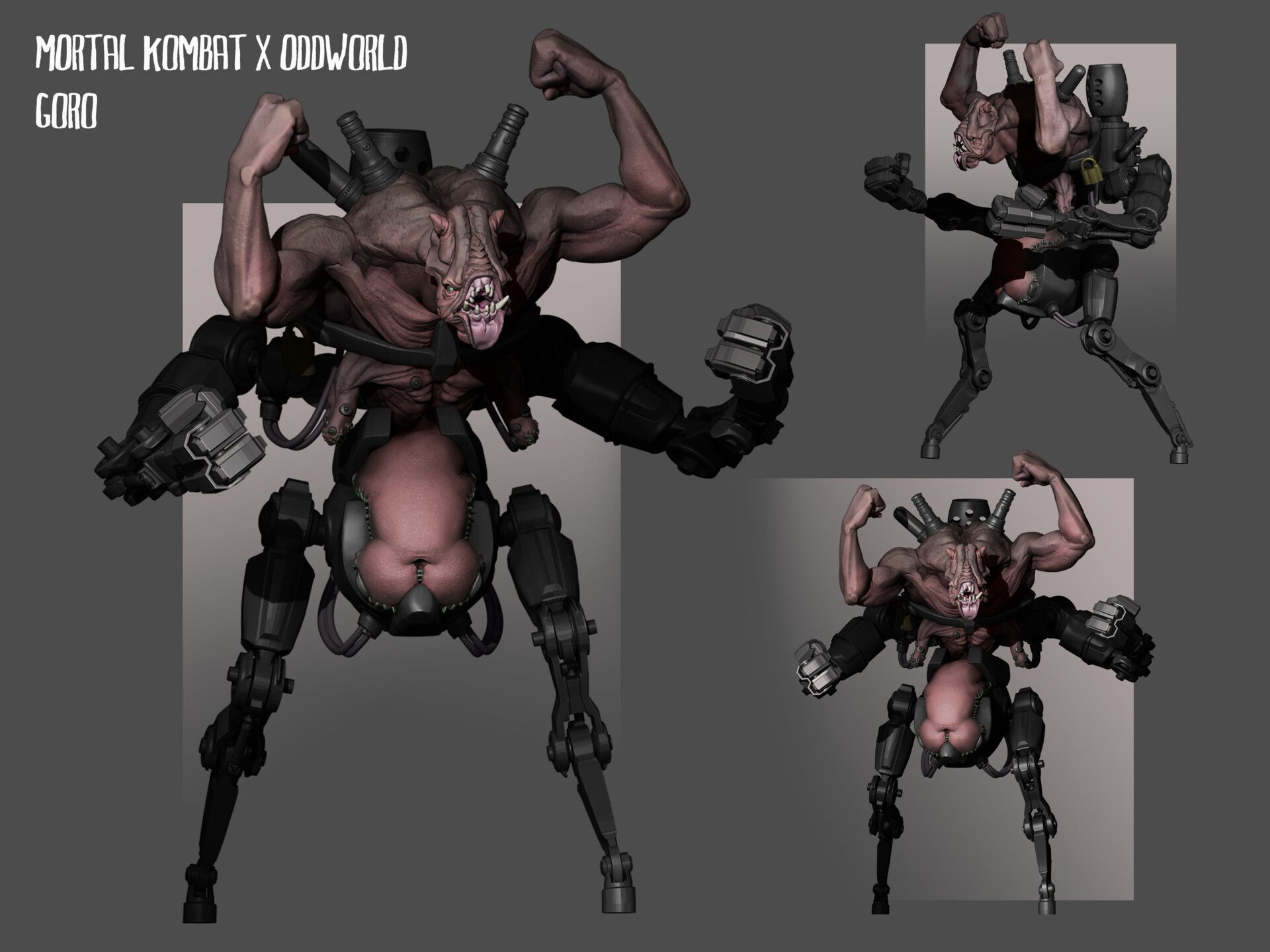
MORTAL KOMBAT X ODDWORLD
Character Design
GORO
The aim was to get characters from Mortal Kombat and reimagine them as if they were in the world of Oddworld.
The challenge was to make them look like they are from the Oddworld universe without losing the essence of the original character. It was important to me that my character didn't look like an existing Oddworld creature. I was super fortunate to get some incredible pointers from Farzad, which really helped me ask the right questions in the design process.
This is my Goro
The original design and sculpt was for my character design class at CDW. I decided to redesign my original work and to try and make it a bit more brutish and akin to MK's Goro.

Below are my original designs done in class. I wanted this character to originally be peaceful, nimble and free. Only to have that ripped away by its captors and turned into a violent monster that is more akin to Goro. This was done to give the character more depth and evoke emotion. Also to hone in on the utilitarian cruelty of the Oddworld universe.
However, I think it didn't quite have the right ratio between the two worlds I was trying to blend. He strayed a little far from the brawny Goro and he looks like he would be very susceptible to damage if hit.


The Redesign
When I decided to redesign the Goro character in my holidays, sprinkled a bit of love on the old design.
Other than sprucing up the presentation this was done to get myself back into the right design mindset.
I put myself in the position of a scientist working at rupture farms in Oddworld. In an attempt to ground my design choices in the Oddworld reality.

This Is the beginning of the new Goro design.
I wanted to make a creature that would be an obvious choice for a base if you were tasked with designing a fighting goro like a monster.
To capture more of that goro vibe it was imperative that the creature was more brutish and looked hard to kill.

Here are the finished Goro renders in all their glory. I'm super happy with how it turned out! Even though at the time it was hard finding the creative juju to go over a design I was finished with from the scope of my lesson in class, I'm really glad I did. The results speak for themself.
I think this Goro is much more cohesive and true to the original character.
If I were to have another pop at it, I might try to push the Oddworld side a little more. But this will do......For now.
For fun, I also knocked up a few fun comic book-style renders of the same model they are at the bottom.


Fun comic book style renders

BACKGROUND ALIEN CONCEPT
Creature Design - Mask project
This is a concept for an alien that would appear in the background of a bar on an alien planet. For that reason, it was designed to be just a simple mask for an actor to wear. There are also some progress images showing the design process


Sacrificial grounds - Digital Painting
For this class we needed to come up with 3 digital paintings of a subject of our choosing, they needed to be from different angles and to convey a sense of story. One was meant to be an establishing shot, another a close shot and the last an interior or story shot.
I usually gravitate towards character and creature design and find composition and environment art particularly challenging. That is why I knew I had to put the time in on this class.
I chose to create a scene of an occult-worshiping secret society at their hidden grounds.

Early stages
Mood boardsLook and Feel
Early rough sketches and blender block outs
Early ideas on shot choices
Click to zoom


CONSTRUCTION
As I constructed the scene in blender, using assets I modeled, sculpted assets from Zbrush and imported Quixel bridge assets.
I further explored the composition of my shots during the construction phase


I was happy with how the construction of the scene was going however the main evil head alter wasn't working for me, as well as the mountains in the background. It felt like it was muddying the design and making the focal point ambiguous.
The doorway was working so I decided to lean into that and simplify the troublesome elements.


SHOT 1 - The establishing shot.
With the conflicting elements removed, I was able to focus on my first establishing shot.The process was to take one of these renders into Photoshop and polish them up. These were my options for my first shot
I ended up with option 3


Shot one finished

Shot 2 - Close up
Shot 2 was a lot easier, as I was working in 3D and the scene was pretty much constructed most of the heavy lifting had been done already. For my second shot, I wanted to go a close-up on the doorway. This doorway lead to the castle ruins which backed up onto a water-filled valley (showing this was going to be my third shot).
This first option felt a little similar to shot one and a didn't like the angle of option two, so I opted for a blend of the two. A closer shot that shows more of the doorway.


Shot 2- Finalized
This is the finalized version of shot 2.I ended up scrapping the idea of valley/castle ruins to be what lies through the doorway. A set of stairs leading up to the altar was more interesting compositionally for this shot. It also was the right move for the continuity of the story between all three shots.

Shot 3- Story shot
Shot number 3
This one had me stumped for a while, I knew I wanted to show the man on the altar and maybe some cells or a torture chamber, but compositionally it was really hard to show all of that as well as all the cool things that were at the water level. Below are some of my exploratory renders trying to work out a solution.I settled on the first option and got to designing some interest for the altar section, there were two of my best options.
I ended up going for option 2. I liked its offset composition and its sculptural details gave it a higher level of interest. Also, I thought the circular moon gate of option one disrupted the flow of the image.


Shot 3 - Finalized.
Here is my 3rd and last shot when its finalized.As you can see I have taken it into Photoshop and worked it up
I was really happy with how this project turned out. I totally flunked the last time I took a digital painting class, so I was a little nervous starting this one. But If the Zac that flunked out last time could see this work he would be blown away. I must be getting better. :P
Below are my final images on the one slider.


Comments (3)