
Adventurers


My projects "Kiera of the School of the Fox" and "Klaus", created during my time at Think Tank Online, are my entries for The Rookie Awards 2022.
Adventurers
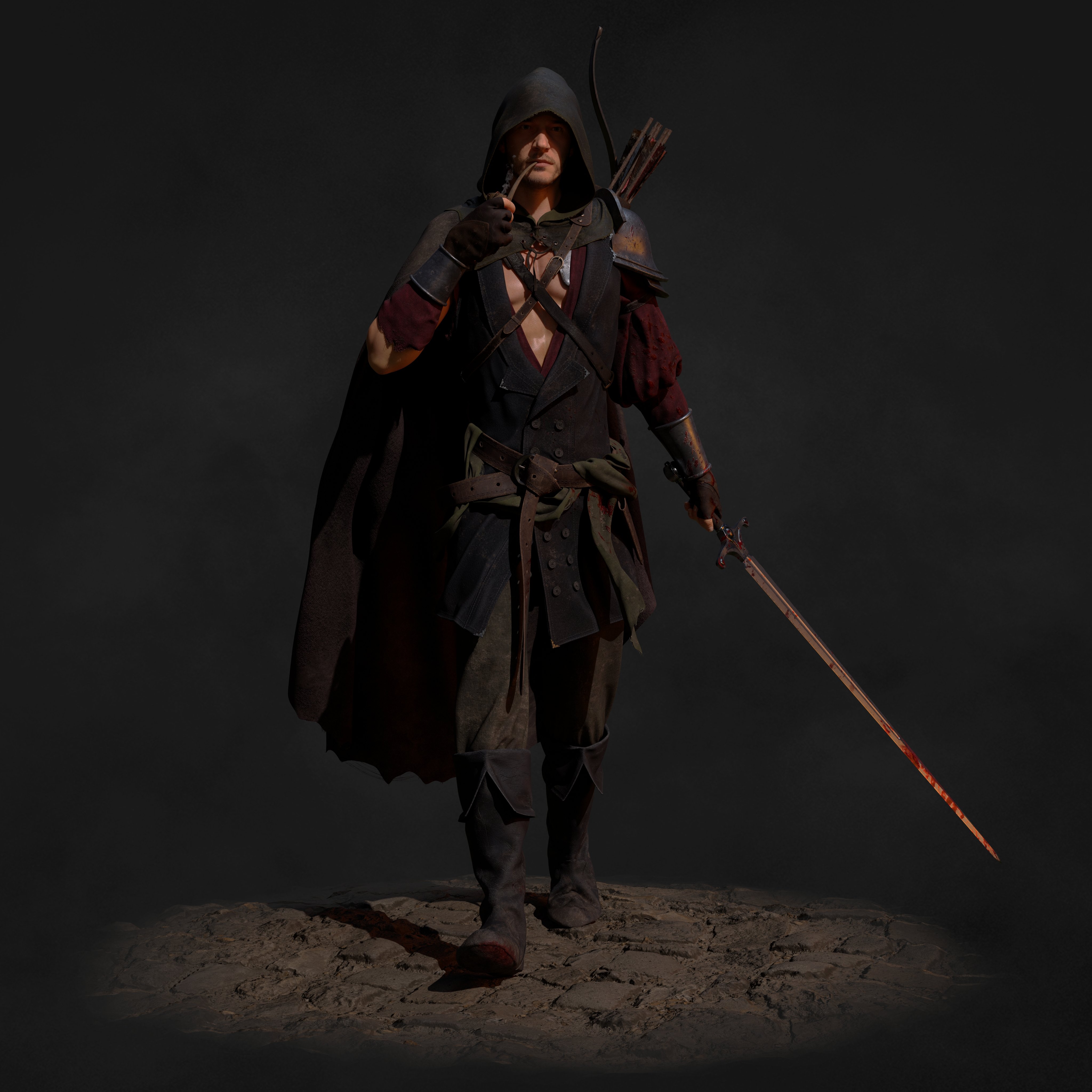
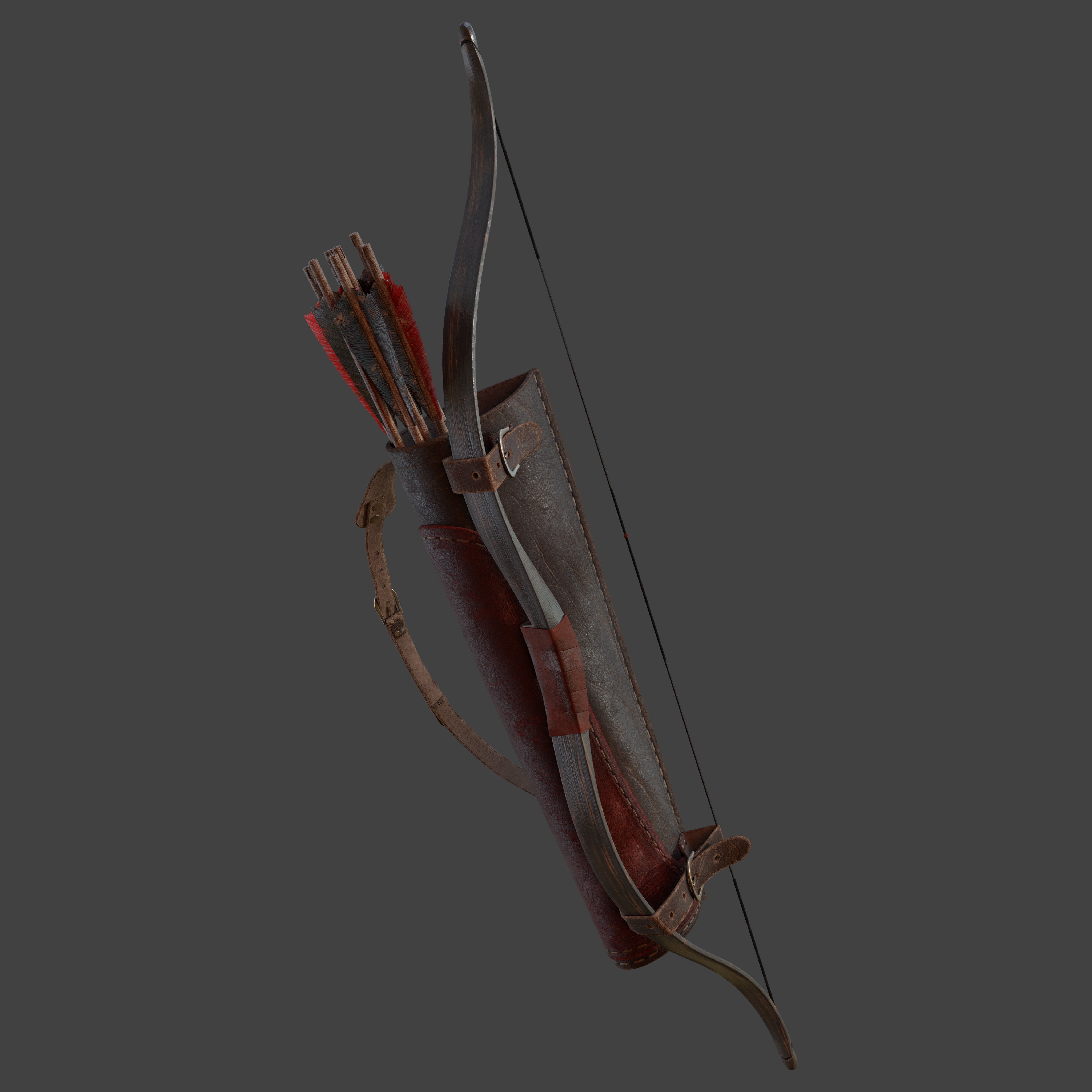
Kiera of the School of the Fox
For my mentorship term at Think Tank Online, I wanted to make a project that really meant something to me, so I decided to try to create a character that would fit within my favorite universe – The Witcher. After countless hours of work, I'm happy to present the result of the first part of my "Kiera of the School of the Fox" project.
Renders


Clay


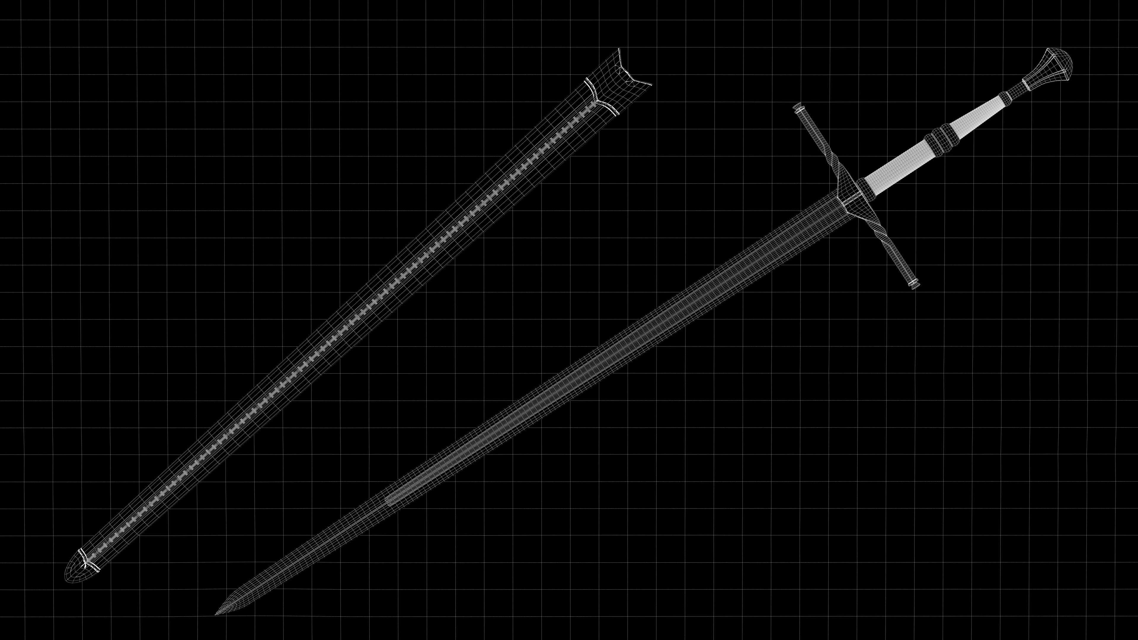
Wireframes


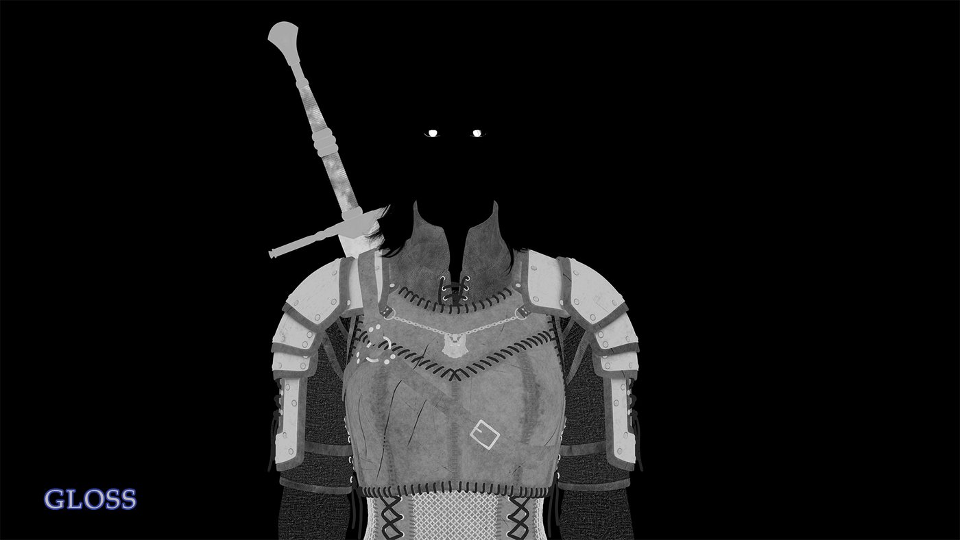
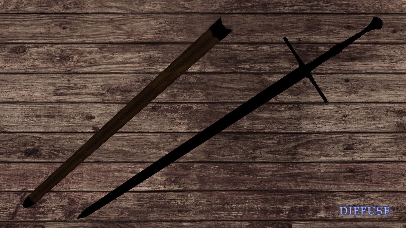
Breakdowns


Workflow
Character Design
Before starting this project, I spent some time on designing the character. I thought of a backstory and which personality she would have and let that guide her overall look. I had also been thinking a lot about the next armor set I wanted for various sword fighting-related activities, so I used that as a guideline to design Kiera’s outfit.
Some pieces of her story came together as I was working on the project. For example, I originally wasn’t sure which color I wanted her eyes to be, I hesitated between blue and amber, and I didn't know if I should've made her a human or a witcher. I started thinking of ways to use both for a more striking effect and thought, “What if her mutations didn’t fully work?” I know she should, in theory, be dead according to the original lore, but in a world of magic, almost anything is possible, especially with a process that has so many uncertainties. I decided to try to make her eyes look only partially mutated, which allowed me to use both blue and amber in an interesting way.
Another design element I hesitated about was the medallion. There are a few reasons why I ended up choosing the fox. Witcher schools use animals as their names because their fighting techniques and armor preferences are reminiscent of said animal. For example, the School of the Bear prefers heavy armor and values defense over agility, whereas the School of the Cat is the complete opposite.
When looking at the way I prefer to fight, I would have a hard time picking between the School of the Wolf and that of the Cat. Interestingly, the Fox school is a mix of both techniques. I chose it for that reason and also because it could give me more design freedom since that school isn’t part of the existing games. Furthermore, I mainly see fanart of the Wolf and sometimes Cat schools, so I wanted to pick something different, even if it is a fanfiction school. I also really like that the School of the Fox is one of the second chances and I felt like this would fit Kiera’s character well.

Once I knew where I was going with the project, I started breaking down every component I would need and searched for references. Once I had a good amount gathered, I organized them in a reference board and then started the concept art.


The Face
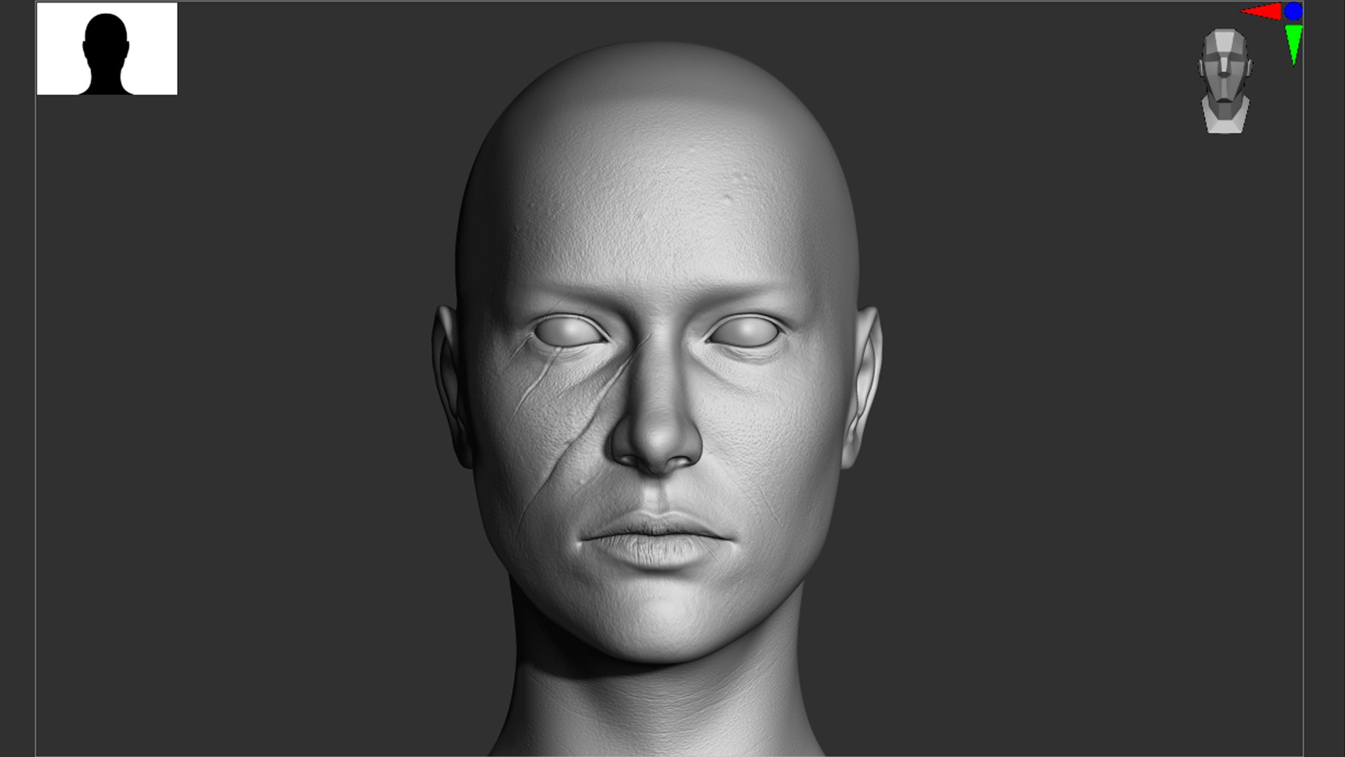
For her face, I started with sculpting a generic female face to get the basic proportions right. I made sure to start with broader shapes and not get into details too quickly before the proportions and anatomy were right. As you can see in the screenshots below, it took me quite a few iterations before I got it right.
Once that step was in good shape, I started trying to work on the likeness of the actress I had chosen, which was Katie McGrath. I wasn’t trying to make a perfect likeness since I wanted Kiera to be her own character, but I like using actors/actresses as reference because I can easily find many angles of the same person. This helps me a lot to understand how the facial features work in 3D.
As the final step, I slightly broke the symmetry in her face based on the references of the actress before starting to work on the displacement for fine details like pores and wrinkles.


The Outfit
The design of her outfit evolved a few times over the course of the project. This was due to situations like finding more interesting references or things not looking or working as well as I thought. My goal was to create a good-looking medium armor that would be as functional as possible while still fitting in with the well-known aesthetic of The Witcher games that CDPR created, so a few revisions along the way were to be expected.
My general modeling workflow usually starts with analyzing the asset in my head while quickly planning how I want the topology to flow and how to best model it. I keep my models relatively low poly and one-sided at first until I’m satisfied with the topology and the shape; this makes it easier to go back and make modifications. Once that’s complete, I add thickness and details. I use creases to be able to get a subdivision preview of my model before adding control edges as the last step. I use the bevel tool to add the latter and then correct what it generates if needed.

For most asset modeling, I’ll work in Maya from start to finish, but for assets that have a more organic shape, like Kiera’s fox medallion, I’ll start by making a sculpt of it in ZBrush. Once I’m satisfied with the sculpt, I’ll duplicate it and use the decimation feature. Then I bring this model into Maya and draw new proper topology on top of it using the Quad Draw tool. Once that’s done, I bring it into ZBrush to subdivide and project it onto the sculpt until it reaches a high enough polygon density to capture all its details. I use the low poly version in Maya and export a displacement map for the render, which will give the model all the details of the sculpt.

For small detail assets that needed to be made out of geometry, I first created repeatable patterns in Maya and then used various tools in ZBrush. I used ZBrush’s MicroPoly function for the grip of the sword to quickly create the braided wire wrap, NanoMesh for the chainmail, and IMM curve brushes for the stitches and string patterns. I made sure to make a few different versions for the stitches so I could have them spawn randomly and create a bit of variation. For the lacing, I used a combination of custom IMM brushes and ZBrush’s ZSpheres.

One of my favorite modeling tools is Quad Draw in Maya because it allows me to draw topology exactly the way I want it. Depending on the asset, I sometimes draw directly on the character’s body or a flat surface. I then use deformers to bend my topology into shape if needed and refine the details as usual.
There is also a plug-in that I use constantly, its averaging and straightening functions especially, called ZHCG Poly Tools. It allows me to be messy with drawing topology and very quickly make the borders nice and even once I’m done. I use the smooth function in Quad Draw afterwards to complete the clean-up process.

For clothing items, I use Marvelous Designer as a first step depending on the complexity of the garment. Creating the right patterns and fitting them to your model can be time-consuming, so when possible, I use real patterns as a reference or Marvelous Designer’s “Modular Configurator” as a starting point. Looking at similar clothing items that I own can also help to understand the patterns and how they are sewn together. After getting a simulation I’m relatively happy with, I export the 2D version and the 3D version of the garment, retopologize the 2D version in Maya and transfer its attributes to get the 3D shape back. I then sculpt some additional folds and make some shape fixes in ZBrush. Lastly, I add thickness and fix the uvs if needed.

The Hair
I wanted the hairstyle to be appealing but still practical for someone who is used to being in a fight at any moment. I originally wanted to pick a “Viking” hairstyle, but I needed to keep it simple because a groom can quickly become an entire project of its own. I decided to go with the half pull-back, which I think is a good balance between function and style. I used multiple different references that I liked as guidelines for the final look.

I used XGen to make the hair once I decided on the design. I set up several different descriptions to have more control: one for the bangs, one for the pulled back part, one for the “tail” of the pull-back which was growing from a hidden floating disk, one for the remaining loose hair, two for the short newer hair, and one for the eyebrows and eyelashes each.
I started by placing and shaping all the guides, then painting the density maps to tell the software where it should grow the hair, and lastly, added modifiers to refine the groom. I had to go back and forth between making modifications to the guides and the modifiers several times while also checking what it looked like in the render preview before calling it done. I kept my groom in a separate document and exported a V-Ray cache of each description to then render them in my main scene together with the rest of the assets.

To create variation and different strands in the groom, I used some simple code within several modifiers to randomly select sections and change their height and shape. I used the same technique to select random single hairs and frizz them up in various ways to create more noise in the groom.

The Texturing Process
For the outfit, I chose this specific color palette consisting of darker tones so she could plausibly blend in with the crowds and wouldn’t really catch anyone’s eye in towns. I didn’t want to make the armor all black because I think the dark brown version is more interesting to look at and also more fun to make. I went with dark blue as her accent color because I like the way it looks with the dark brown armor and it’s also a hint toward the School of the Cat.
My favorite software for texturing is Substance 3D Painter. It can get a bit slow if you have many layers and/or models in one document though, so to keep my file sizes down and performance up, I split up my models in multiple documents and set the same export names and locations in each. No overriding would occur since I worked with UDIMs, so each texture map would get its proper tile number assigned. Once I was done with recreating a material, I saved it as a smart material to use on the next pieces in other documents. Only minor changes and redirecting of some masks were required, so it saved me quite some time.
My general texturing workflow starts with some organization. I break down which types of materials the asset will need, create a folder for each one and assign a mask for the corresponding regions on the models using the Polygon Fill tool set to UVs. I can soften or break up those masks later in the refining stages if I need, depending on where the UV seams are.

For each type of material, I start with a “base” texture, which is usually either an existing Substance material or from a free open source like Poly Haven. I adjust the color of the diffuse map with a Color Match filter and then add one or two layers for extra color variation driven by a smart mask or a repeatable alpha. The same can be done for roughness variations. I quite like working procedurally to start with and pressing the “random” function in smart masks or rotating through repeatable alphas until I get something that I like.
After that, I use ambient occlusion maps as masks from the bakes to accentuate shadows and from texture maps to change the color of fine details. That technique helps with materials like the soft leather trim where I changed the color of the cracks and wrinkles. For more precise details, like the deep scratches on the armor, I paint masks by hand and adjust the settings I need manually in custom layers. If I add visible dirt, I do it last with some procedural masks and hand painting.
Sometimes, I don’t use all the maps from a “base” material and instead combine maps I like from multiple different materials. I did the latter for the gambeson because I liked the height map that had the diamond stitching but I wanted a different fabric texture. This can require creating a few masks and utilizing anchor points and modifiers. For example, to isolate the fabric from the stitches, I turned the fabric color to white and the stitches black and set the blend mode to multiply. This allowed the color from the other fabric to show through and I could then use an anchor point to point to this mask and use it anywhere I needed it.
For the fabric elements, I added repeatable folds and wrinkles textures from Surface Mimic. Depending on the look I wanted, I masked out certain areas or softened them with a Blur filter. For the very small stitches on the various garments, I used Substance 3D Painter’s default stitches brushes. These elements really helped get that extra level of detail.


Recreating the dye technique that my main reference artisan Soeurs d’Arme uses was my favorite of all the materials to recreate. I first started with a light color base made out of one of the leather materials from Poly Haven followed by a dark reddish-brown layer with some smart mask properties and a third even darker layer with very similar properties for the edges.
Once the gradient was made, I added more layers for the little black dye dots, adjusting the roughness, the light surface scratches, bumps, and indents. To create the holes for the stitches, I used a modified ambient occlusion map as a mask on a negative value height layer. As a final step, I added a height map from a different leather texture tiled very small to add a little bit of micro detail for the close-up shots.


To texture the skin, I started by using the R3DS Wrap workflow to apply TexturingXYZ maps to the model. I baked the maps with XNormals before using Substance 3D Painter to patch up and refine the textures.
I made the initial diffuse map lighter and desaturated it to get more of a pale witcher look. I then did some hand painting to bring back the color variation I had lost with the previous step and to add more tones such as the dark circles under her eyes. For the skin and pore details, I used ZBrush to create a displacement map. I started with importing the TexturingXYZ map I had baked and then patched up, extended and refined areas with brushes from TexturingXYZ as well as some others I liked from the ArtStation marketplace. I added a micro detail map in the end, which was a repeatable pattern once again from TexturingXYZ, to break up the space in between the pores.


I knew I wanted her to look a bit rough, so I wanted to showcase some scars on her face. I tried to think of which type of encounter would have caused them and how old each one should be. To give them variety, I chose to add the small one on her cheek as the oldest and added the fresh cut on her lip.
I started by using Substance 3D Painter’s new wrap projection function with their “Hypertrophic Wild Scar” material. This allowed me to quickly design and place them. Once I was happy with their position, I exported the height map and brought it into ZBrush for some extra sculpting. I made some overall corrections, added more depth and details, and sunk in the largest scar in the softer part of the face. This helped give the feeling that the wound was once deep in that area, illustrated by the slight curling inwards of the skin.
I went back to Substance 3D Painter to make a micro details map for the finer striations of the scarring and for the half-healed structures of the fresh cut on her lip. I used references to decide on each scar’s color depending on how old they were and made sure to match those colors with her skin tone.


The Final Renders
I used V-Ray in Maya to render this project. My lighting setup was relatively simple. I used two lights in a Rembrandt style, one for the face and one for the rest of the body so that I could control their intensities and slightly shift the angles independently. I had one extra high-intensity light that was bound to only affect the water line where the eyelid and the eyeball meet to get some nice reflections. I used two lights for the main rim light, one for the sword hilt and one for the rest. I also used two very low-intensity dome lights: one used as a general fill light to make sure nothing was in complete darkness and one that was imitating moonlight.

To enhance some shadows and add some depth, I used Photoshop to add the “v-ray dirt” render pass (ambient occlusion) on top of the renders.


Klaus
"Klaus" was inspired by the concept art below drawn by Siwoo Kim. I designed the archery set for Klaus based on one that I own, modifying it to match the concept art. I worked on this character as my final project for my Intermediate and Advanced terms at Think Tank Online. It was my first full character project and I learned many things, all of which I then applied to my next project.

Renders


Clay


Wireframes


References

Special Thanks
Although it took me 8 long years of hard work and multiple different educational programs to finally get to this skill level, I'm truly proud of the progress I have made, especially over the last two years at Think Tank Online with the creation of these two projects.
Special thanks to Pietro Berto, Joe Crawford and Raffael Frank. To my family, friends and fellow classmates of TTO, everyone who helped and supported me throughout this long journey, thank you. I wouldn't have gotten this far without you.


Comments (2)