
Alyssa Mackersie 2022 Portfolio

Hi there, my name is Alyssa. I am a passionate, energetic, ADHD, plant-obsessed, graphic and motion designer. I started my career at Savannah College of Art and design with graphic design but these day I enjoy taking my design skills and putting them into motion!
FEARS AND CONFESSIONS
Poetry can be a powerful tool to help communicate ideas information and struggles. Angela Augear’s poem struck me in a way that resonated deeply with the type of work I want to produce. Fears and Confessions is a project about understanding what ADHD is beyond a diagnosis, about making everyone understand what it can feel like. Using stark contrast, each word hits like a sucker punch on the “page.” As someone with ADHD, I went with the concept of a square peg in a round hole, how it feels like you’re suffocating trying to fit in. The words fill up the screen, overflowing, or get boxed in and fragmented.No illustration or frills are needed because it is the words that have the power.


FRIENDS LIKE THESE
Bartenders say you can tell a lot about a person by how they order. Whether they are ordering to impress or they are a creature of comfort; there are so many ways to go, it reveals a bit of your personality. “Friends Like These” explores that concept in order to promote its message: the warmth comes from the company you keep, not what’s in your glass.
The design of friends like these is a combination of collage and illustration. The project uses warm tones and carefully selected sound design to help evoke the comfort of going to your favorite bar with your closest friends.
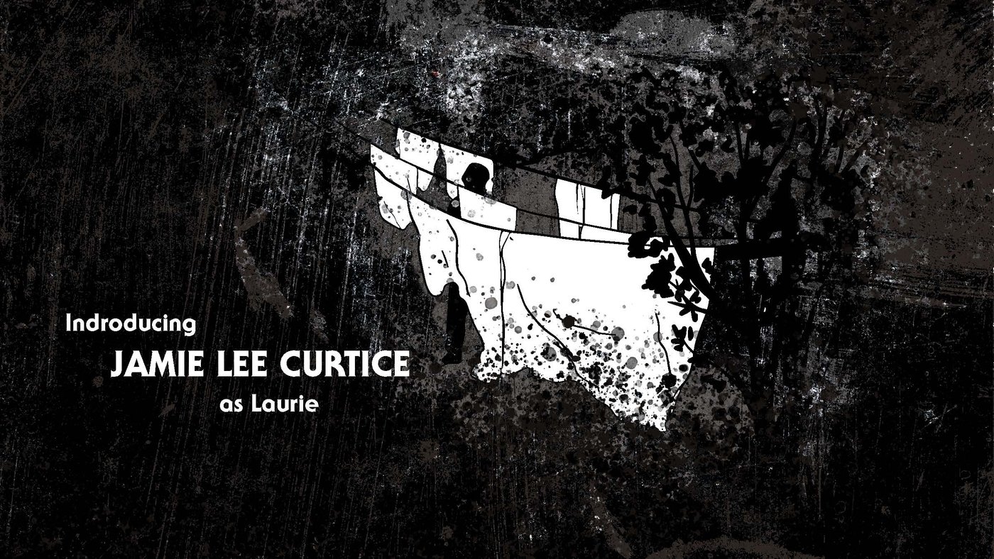
HALLOWEEN
The redesign for the Halloween Title Sequence draws from the build-up of the paranoia and suspense within the movie. When describing this kind of suspense, the creators compared it to the stretching of a rubber band; you feel the tension, the build-up, and you know something is coming, and even though your anticipation says run, you are stuck waiting. Sometimes you are right and there is something lurking in the shadows, but more often than not it takes you by surprise.
Additionally, the creators talked about how Micheal Myers (the killer) was more often described as the shape. He was a figure that melted into the shadows, just barely within what your eyes could adjust to. This was the primary inspiration for the design; having your eyes adjust to each scene and not beginning certain that what you see is actually there.


HALLOWEEN STYLEFRAMES
CINDER
The Cinder title sequence is a design based on the book Cinder by Marissa Mayers. It is a story of future technology and romance amidst political crisis while tying back to the original Grimm Fairytales. The design reflects this by combining an illustrative storybook style with harsh futuristic vignettes straight from the book.
CINDER STYLEFRAMES


ASSET CREATION
For most of the title sequence, there are two futuristic typefaces used. The title design is a modified version of the primary typeface, Anurati, taking inspiration from the intricate designs of storybook drop-caps. The other designs are hand-drawn characters or iconography from the books, to aid in the feeling that this is set with the pages of a book.


SHARED MOMENTS
PHASES THROUGH TIME - frame by frame study
PERSONAL LOGO - frame by frame
STAND WITH UKRAINE - frame by frame project snippet


Comments (0)
This project doesn't have any comments yet.