
Achromatic Assets & Concept Art
Art collection for the canceled student short movie project, Achromatic.
Achromatic Assets & Concept Art
Achromatic
Art collection for the canceled student short movie project, Achromatic. It was an original idea of mine, I was its director and art director. The project lasted for a little over a year. The idea of mine behind the project was to explore the themes of gender, sexuality, norms, traditions, and belonging. The artistic direction taken for the project was to speak about the themes in abstract terms, through a world that is set on a canvas for acrylic painting which only has two colors, blue and pink. I am proud of the transformation the story and art of this project have taken, like its main character, Violet which has found its own color in a sea of two tones.
Assets
Let's start with the assets that I had the pleasure to work on for the Achromatic student film project. I have completed the houses and 2D environments for the film (making a 360 matte painting was a lot of fun). I have also worked on the shader and compositing techniques for the film. Here I also added a 2D frame-by-frame paint over for an even greater painterly effect.
The workflow for the assets shown here was the base mesh of the assets was created in collaboration with Sandro Girardi except for the houses, rigged and animated using Mixamo, unrigged parts were manually animated in Zbrush, blur frames and stop motion effect was manually added in Zbrush, texture variation on purple Violet was manually painted on each frame in Zbrush, Sandro Girardi lit the scenes, we also worked on the Arnold Toon procedural shader together, then I created some procedural comp setups and composited the shots with 2D backgrounds as well as did a 2D paint over on each frame. It sounds like a lengthy process but we have developed a lot of shortcuts in the production process.
Big thanks to Sandro Girardi for working with me on finishing up the assets' presentation after the project got canceled.
Concept Art
Let's start with the posters that I had the pleasure of designing:


Characters
The main character, Violet, an outcast from the world who challenges the norms and finds a new color in the world of pink and blue, Violet finds purple. The design had changed over the course of the pre-production of the movie to address some technical issues of rigging and fx of the first design.


I designed first few versions of, Taffee, representative of pink characters. For pinks we were going for bubbly and round shapes from the very beginning.


In the early versions of the movie there were quite a few secondary characters, such as shopkeepers and crowds.


Characters' Movement
I have done a few explanation sheets to give the riggers and animators an idea of what the characters' anatomy is and how they behave and move to help the storytelling.


For each expression and posing sheet I have marked the shot number as at this moment of the production of the film we had a more or less concrete animatic.
Violet in terms of acting was supposed to be very human, to be that audience surrogate and connect with the viewer.


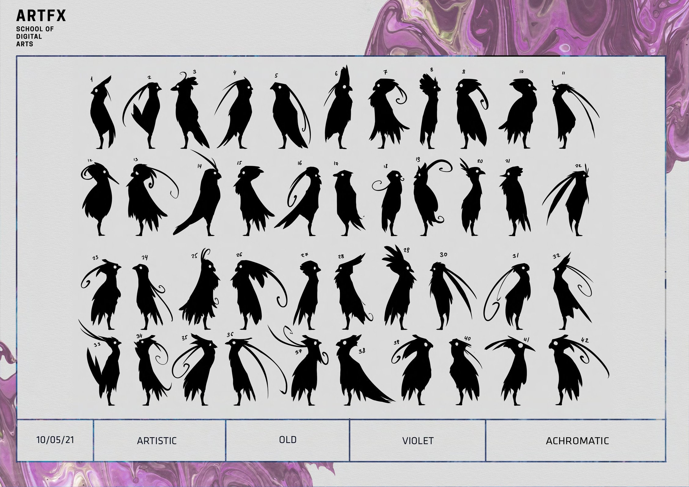
In the meantime for blue and pink I had an idea of them behaving more like birds rather than humans, which is inevitably what causes the miscommunication between the rest of the world and Violet. Two different body languages. For facial expressions of both blues and pinks the area around the eyes doesn't change much, this was a deliberate choice to further dehumanize those characters and in turn amplify the expressivity of Violet.


Props & Environment
For the first designs of the birdhouses I was inspired by bird feeders, later on the houses' shapes became more abstract to reflect the designs of the characters.


FX
In the first version of the project the characters were supposed to transform into monsters to tease each other, but the main character has overdone it completely by transforming into "the most terrifying creature that the world has seen". At the same time, the transformation of the blue character was supposed to look very silly and not too scary compared to Violet's version.


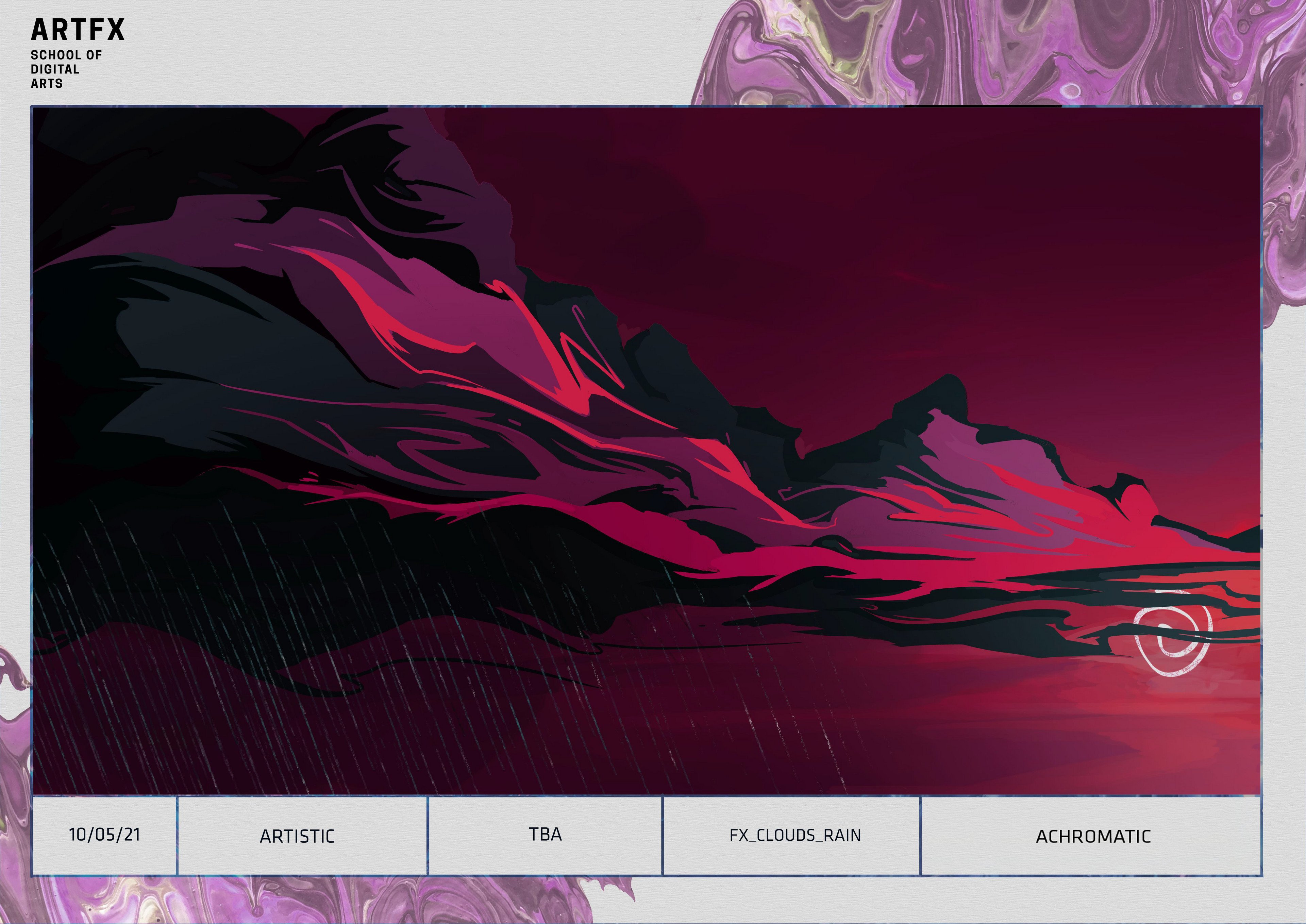
I had an opportunity to create a concept explaining how the FX of the rain and its interaction with the characters would look like taking into account the acrylic paint nature of the characters.
Later on the rain was replaced by a tsunami. It would essentially wipe the paint away and mix it inside to a point of burgundy color. The wave was a manifestation of Violet's sadness after being rejected by both groups, a destructive force that Violet had to face.


Light & Color Boards


Keyframes


Comments (0)
This project doesn't have any comments yet.