
Lighting/Lookdev Reel - Laura Ludwig
Welcome to my entry for this year's Rookie Awards! In the last months I created these three projects as a part of my lighting/lookdev demo reel at PIXL VISN media arts academy in Cologne, Germany. I tried to give a detailed breakdown of my workflow and thought process on each project.
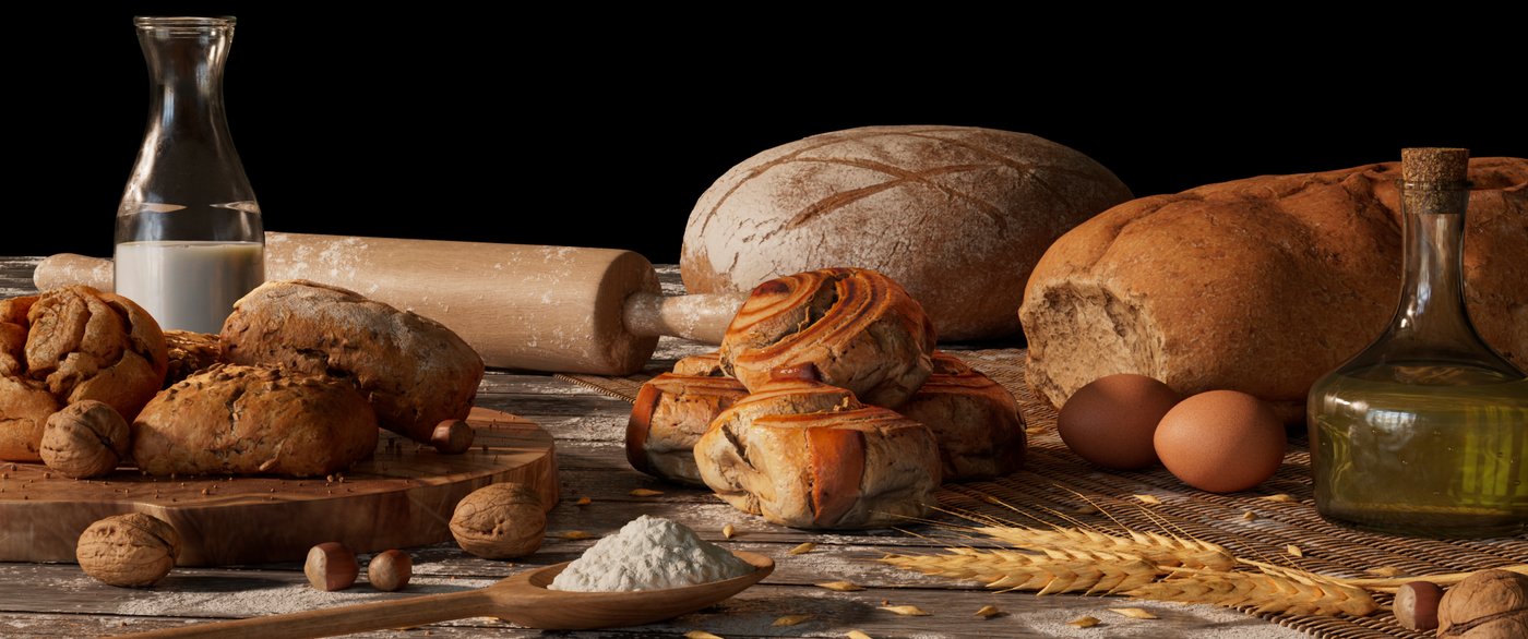
Bakery - Still Life
I knew right away that for my demo reel I wanted to create a still life, as I think it’s really suitable for showing organic shading and creating a scene that reminds of a piece of art.
Getting started I Preperation and Layout
When searching for ideas for this project, I immediately had to think of a scene full of bread and pastries. For the mood of this artwork, I had two scenarios in mind: A darker, moody scene, which you can often find in paintings, or quite the opposite – a sunny, bright scene. I decided to go with the latter, but I will dive further into this a bit later.
Having decided for the scene, I searched for inspiration for my layout. For this, I looked a lot at photography of exactly this kind of scene and tried to figure out which parts I liked and which I didn’t. What many of these had in common and what I think worked kind of well to create an artistic scene, was having everything quite messy. Flour, grains and crumbs spilled over the table, slices of bread and buns lying on top of each other, but still often centering around an object or central point.
When I created my layout, I tried to keep these points in mind. For my focal point I tried to choose something different from the other assets. Whereas most of my assets were either some type of bread or some kind of ingredients like the wheat or flour, I chose to set focus on the curly buns, as I imagined them to be some kind of sweet pastry compared to the neutral bread. Also, considering an emotional approach to compositition, we tend to crave sweet things rather than plain ones, so I wanted the viewer to really feel the focus, to crave the rolls in the center.
The Surfacing I Shading, Texturing and Lookdev
As most parts of my scene are Megascans from Quixel, they already shipped with texture maps. Despite that, they weren’t just ready to go, so I took every asset into a separate lookdev-scene, in which I shaded them until I was happy. For this process I used a lookdev tool made by Dusan Kovic, which allowed me to easily check my asset with different lighting situations and environments.
To me, getting the shading of organic objects right is especially important as we tend to recognize any mistakes faster, so I collected a lot of references for each object and tried to get the shading as close as possible.
The hardsuface props I either textured in Substance Painter or shaded them procedurally inside Arnold. I tried to add some nice breakup to the textures, especially the diffuse and roughness map, as nothing in the real world is perfect and this is the key to realism. For example on the glass bottles, I added fingerprints and scratches in the roughness since these are things that happen to them when the are touched and used everyday. Aside from the imperfections that are being added by human influence, no bottle comes out of production perfectly, so I added a broad noise to the bump map which resembles slight changes in the thickness of the glass. This result in the reflection not being a straight line, which would look cg, but a bit more broken up. To get the flour patches all over the table without having to choose a super high resolution, I created a tileable texture which I then layered on top of my base texture.
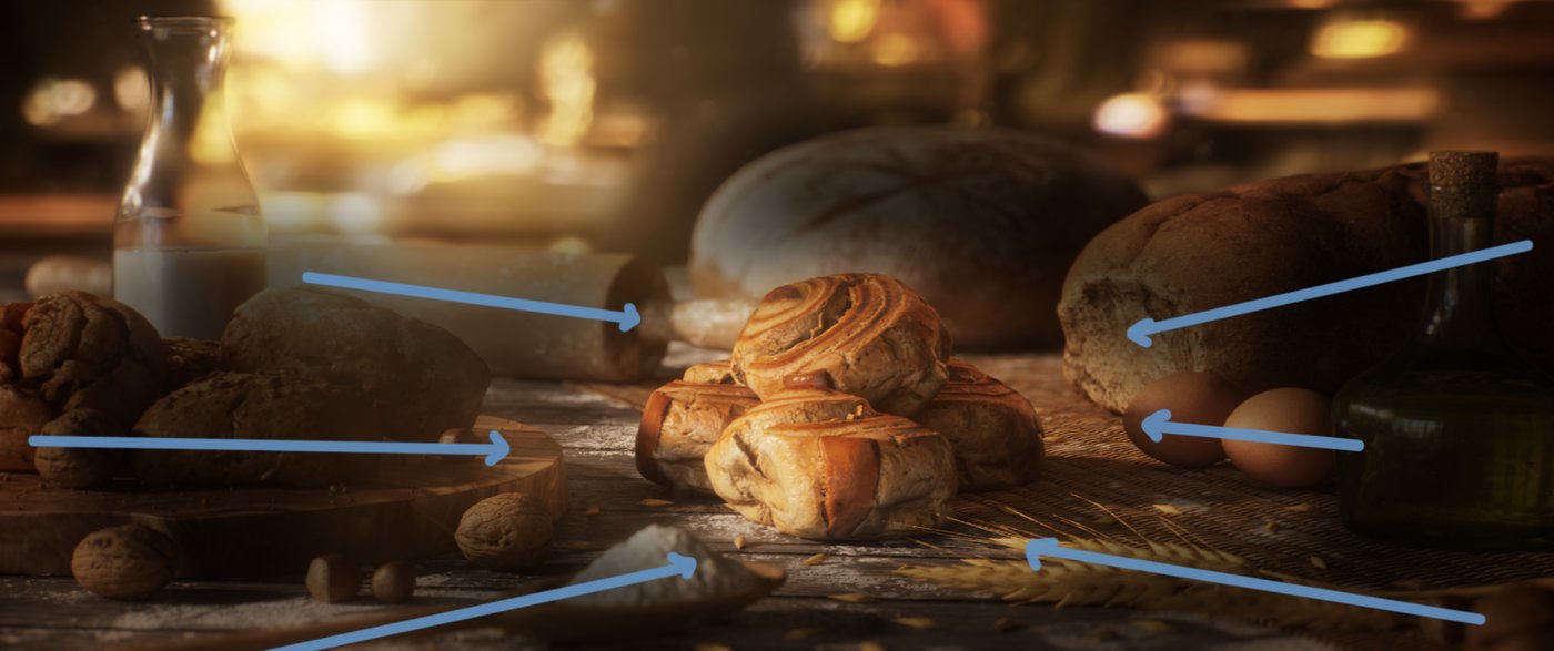
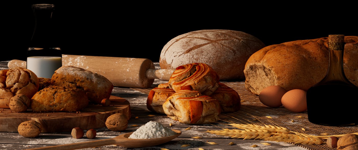
Clay Render | Diffuse + SSS | Specular + Coat | Transmisson
Creating the mood I Lighting, Rendering, Compositing
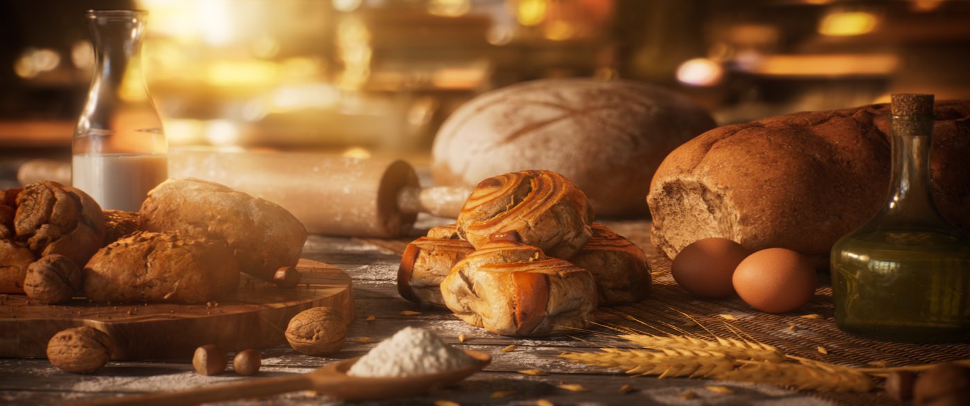
As I explained earlier, lightingwise I decided to go into a sunny, warm direction. Again, I collected references to guide me getting the right color, position of lights, contrast and overall feeling.
I started with the sun – for this I used a directional light which comes from a low angle to achieve nice, long shadows since I wanted the scene to take place rather early in the morning. As the sun performs as the key light in this scene, I spent a lot of time to find the perfect position. The scene is more side-lit, so I got some nice shaping. Catching all the small details from the grains and crumbs and the general displacement was important to me, as it makes everything look more interesting and was also something I noticed in most of my references. It’s not only about the light, but also about the shadow in an image, so I also tried to get good shadows, hiding things partly, but not too much.
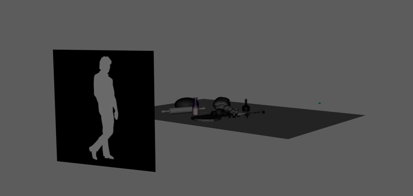
After I was happy with the sun, I moved on and added a skydome light with a soft interior hdri to fill the shadows and to have an overall ambient light. To get some even nicer shaping and highlighting that I wasn’t able to achieve with the sun, I added a warm and sharp rim light to the buns on the screen-left side as well as a broader rim light to the right side of the curly rolls. This helped to match the backlight from the footage I added later and to make the rolls look more interesting. As my background footage contains people moving, I decided to implement that into my light and make it a bit more dynamic by having an animated plane functioning as a light blocker. It has an alpha map of a man to mimic a person walking by. This also helped to better show how my shaders and materials interact with light.
After that, I was happy with the lighting in Maya, so I rendered everything out. I rendered this project, as well as all of my other ones, in ACES colorspace to achieve richer colors with a way higher dynamic range that wouldn’t be possible in srgb, but also to work as closely to industry standard workflows as possible.
With my renders finished, I took everything into Nuke to do the compositing. I rendered out my lights on seperate AOVs as well as all the direct and indirect shading events for each light group, so I could use them to recreate my beauty and have total control over everything.

First, I tweaked the lights and did a bit of color correction. Then I added my background footage, which I stabilized, defocused and graded to match my render. To bring the light blocker from my render in a better context, I got green screen footage of a man walking from the internet, keyed it out and adjusted it a bit to merge it onto my footage after. I projected everything onto a card, merged my render on top and integrated it a bit more with an edge blur and light wrap.
One of the problems I had to face during the compositing was to get the refraction of the background which you usually would get from the milk bottle since it was just 2D footage and I was adding it without any distortion or refraction. What I ended up doing was to create a STMap inside Maya, project it onto a plane in the background with my glass bottle in the foreground which refracts the values of the STMap correctly and to use this to drive the UV channel of my iDistort node in Nuke. This allowed me to adjust the distortion of the background with the correct refraction.
At the end I utilized Nuke's particle system to create some particles floating through the air. In a 3D scene I combined them together with my geo which I cached out as an alembic before, to have some particles masked depending on their position in space, so it feels like they are really part of the scene. To finalize everything, I added volume rays and some lens effects to make everything feel more real.
Snail adventures
This was a group project which I did together with Markus Grothaus and Gianluca Pani Casanova for a class at Pixl Visn. They were responsible for modeling and most of the texturing.
Getting started I Preperation and Layout
While searching for ideas we stumbled across a photo of two snails on mushrooms and decided to use this as our main idea. After that we searched for similar photos and artworks and I created a first loose blockout based on a mix of these references.
The composition is based on the golden ratio, with the left snail being placed on its ending point. Some of the scene elements are aligned with its path, so the eye is naturally drawn to the left snail.
I placed this snail on a slightly smaller mushroom and we decided to animate it looking up into the direction of the other snail which directs the viewers eye along the motion of the head, ending up at the screen-right snail. We also wanted to work with a heavy depth of field to emphasize the small scale of the snails compared to the rest of the real world and to give the feeling of really being part of the scene.
The Surfacing I Shading, Texturing and Lookdev
For this project I did not only do the lookdev of the assets but also helped with the texturing, for example for one of the snails. As the model that was handed off to me was only the lowpoly, I had to decide whether I wanted to sculpt the skin pattern in Zbrush or paint the displacement map inside of Mari. As I feel more comfortable with Mari, I decided to go with the latter. After subdividing it to match the smoothness level it would have at render times, I brought the model into Mari. For the displacement I used frog scans from texturing XYZ as I thought they'd come relatively close to the spots on the snail's skin and provide an insane amount of detail as well. Since I tried to not have the spots look too uniform, I painted them one by one and transformed them inside the paint buffer in between. It was a bit challenging to place them in a natural way that matches the behaviour of the real patterns because I noticed that it wasn't as random as I thought at first. Later I masked the displacement strength slighty off in the y-axis, since the displacement gets weaker towards the bottom.
I noticed that even though snails seem to have a pretty uniform color at first, there is actually a lot more to it and that they have quite some color variations in their skin, so I tried to match that and bring different colors in. I made use of the displacement map I painted prior to create different variations which I used as masks for the cavities and spots.
For me, the hardest part was the texturing of the shell as they are very unique in nature. They have a lot of different colors and patterns that are mixed and interrupted, which I didn’t find that easy to recreate. For the displacement I didn’t have any suitable scans which is why I searched online for textures I could use. By watching other texturing artists, I learned that sometimes textures that don’t seem obvious at first can be really useful. So, I searched online for textures and images that have a similar structure to the grooves of the shell. As a result I found an image of a stone wall with long, thin but partly discontinued and damaged bricks which I found suitable for the project. Again, I used patches of the image to paint the displacement map which I then could utilize for the other maps. I also added some dirt to the shell.
As snails depend heavily on subsurface scattering, it was important to get the right amount during the lookdev process. I noticed that in my head snails had way more sss than they actually do in reality, which was a good reminder of why using a lot of real world reference is so important. I tried to find the right blend between a translucent and a rather solid-looking body. Another important characteristic of snails is their shiny skin, which is caused by the wet slime they produce. As in the real world this is a separate layer on top of the skin, I used the coat lobe of the shader which functions as a second specular layer on top of the normal specular of the skin. I set the coat roughness to a low value and ended up with the shiny coat I was trying to achieve.
The rest of the lookdev went really smoothly because the textures my team mates provided were already quite good. For every asset I made several turntables which we then reviewed.
Creating the mood I Lighting, Rendering, Compositing
Even though we held everything in an overall realistic look, we aimed for the scene to feel very dreamy and stylized. To create this magical look I used a lot of warm, soft lighting. I wanted to have a strong backlight to emphasize the subsurface scattering of the snails, mushrooms and plants. Once again, I started with a skydome to get a base for the lighting. I added a light blocker to the scene to mimic shadows cast by leaves and trees, as the scene is located inside of a forest and not directly exposed to the sun.
However, this light was not enough, so I moved on and added a stronger backlight for both of the snails. I tried to place them in a good way to get a nice shaping of the round geometry of the snails and mushrooms, to give them a good rim and accentuate certain details considering that these things help a lot to create clarity. This also helped, to get a better focus on the snails. Since the grass and plants in the background were still pretty dark, the next step was to add lights to fill them up.
At that stage I was happy with the light rig but wanted to add an atmosphere volume to create some more depth. To not have every light affecting the volume and also to have more control, I disabled their ray contribution to it and created another big light with a warm color to the scene which only affected the volume.
Because I switch a lot between Maya and Nuke while working on lighting and therefore knew early in the process what background I would use, I knew the snails would have a nice silhouette with them being dark on a bright background.
For better quality and more efficient rendering I split the render into foreground, middleground and background layers. As I knew that the background and foreground would be completely out of focus, they didn’t need to be sampled as high as the middle ground.
After I did the first renders, I encountered some rendering problems. One of them was flickering highlights on the raindrops. Fortunately, this was easily fixed by increasing the roughness to a point where they still looked natural and by enabling AA sample clamping in the render settings. However, another challenge I had to face was adding depth of field in Nuke. As the grass and some other plants consist of really fine geo and the beauty – contrary to the Z pass – gets antialiased, these parts were messed up and jaggy. I figured that just enabling AA on the Z pass wasn’t the best solution because it works differently on them and wouldn’t be as accucate, so I had to find another solution which wouldn't necessarily end up in super high render times. So, I decided to learn something new and took a look at deep rendering since I knew it was known to be very accurate.
It was a bit hard to grasp at first as I didn’t found too many resources on it on the internet but after asking some people and a lot of trying out on my own, I think I got it. I still had a bit of flickering in the grass but decided that it was time to move on. Still, I’m kind of happy to have encountered these problems because I learned a lot from them.
In Nuke, I added all my render layers as well as my background together, graded lights and other elements and added the depth of field. I tried to integrate the background well and also added another volume ray and particles to really feel the sun. At the end, I added a vignette for more focus, glow, some lens effects and distortion and a last color grade. Overall, I’m really happy with the outcome and the mood this project conveys.
Scorpion desert
This project was a collaboration with Jacob Döhner who did a great job on the animation of the scorpions. It was also the first project for me that had more than one shot.
Getting started I Preperation and Layout
The initial idea for this project came when I saw that CAVE Academy was offering a free scorpion rig on their website. I remembered that there was an animal skull among Quixel’s Megascans and that sparked the idea of a scorpion crawling over a skull. The idea of two scorpions interacting with each other was actually developed later in the process.
When I started blocking out the scene, it actually looked quite different from the end result. The ground intially had a lot of uneven ground and hills, but after looking at more real world reference and desert photography and decided it would be much better to have a flat ground, reference wise and aesthetically. I began to place and scatter some assets I wanted to use around the scene but it ended up being way too much and distracting so later I reduced it by a lot.
As I initially worked with only one scorpion, I tried to place it on one of the thirds. Even though both scorpions are moving, on the ending frame of the first shot, we tried to have each on a third, at least on one axis.
The curves and shapes of the skull served as good guiding lines and helped to draw the viewer’s eye to the scorpion in a natural way. You can also find the curvature of the skull again in the scorpion’s tail, which made them work well together.
From the beginning on, I thought a second, close-up shot might be nice for this project, so we added it. We implemented a similar layout on the second shot, again, having both scorpions on thirds at the end with the skull connecting them visually.
The Surfacing I Shading, Texturing and Lookdev
Since CAVE Academy only provided the model and rig, I had to do the texturing on my own. As I didn’t think I’d need a specially painted displacement map this time, I started to paint the base color in Mari right away. I tried to find out the characteristics scorpions have and to implement them into the base color, like the color changes on the torso.
I picked several base colors from my references and combined them using different procedurals to get a good color variation to start with. I did the same for every other color I added later, so I don’t have solid colors that would look artificial. I added other elements like darker edges on the shells and the tail segments, layered multiple dark areas on top of each other and added some details on the claws and tail.
For the bump map, which I later decided to actually use as displacement instead of bump, I simply combined some noises with different frequencies together, their strength depending on the body part, as not all parts are as bumpy as other ones. The only other map I painted was a sss weight map since not all body parts share the same amount, especially the parts with the shells on top have a way lower sss weight.
To have proper control during the lookdev, I also exported several masks which allowed me to change colors and values. For this project it was again important to find the right subsurface scattering amount. This was quite challenging because it was different for each reference, so I tried to find a good blend. At first I didn’t feel the need of a roughness map because the displacement broke it up quite well, but later I decided that it would give it a more organic look to add some kind of roughness map to it – an efficient solution for this was to use a noise inside Arnold which I modified a bit. I lowered the contrast and found a good scale but what really helped to make it more organic was to raise the number of octaves and bring in a good amount of distortion - this made the noise more defined and less uniform.
Something that was relatively new to me on this project was the grooming part. I used XGen interactive grooming to create hair all over the body. I roughly adjusted basic parameters like the hair width, density multiplier and overall scale. Then, I used the density brush to remove the hair on parts where I didn’t want it to be and make it less on some other parts.
I collected some more reference with focus on the hair and adjusted everything to match it closer. I also added a noise modifier to bring a bit more breakup into the shape so the don’t all have the same direction and look too uniform. I used the aistandardhair shader which gave me good controls that are specific to hair. I decreased the melanin and increased redness and roughness to get closer to the reference. Also, I used taper to have the hairs thinned out at the tips so they look more natural.
Creating the mood I Lighting, Rendering, Compositing
The lighting process for this project was long and challenging for me. It actually started out very different to what it actually ended up like at the end. My initial plan was to create a hot desert scene where you can really feel the sun burning, so I started by taking the lighting in this direction. However, I wasn’t happy at all with how this came out – I felt really limited with the lighting to not create a too artificial or staged feeling, it was really hard to bring out the scorpion with all it’s orange and brown tones that were so similar to the colors of the environment and above all, it was just too similar to my other projects. So, I turned everything upside down and made it into a night scene.
I started with a key light facing the skull to make it a bright spot the eyes would go first. I also tried to give both scorpions rim lights to separate them better. Nevertheless, this first attempt didn’t work very well as the focus was immediately drawn away from the scorpion to the bright spot on the skull.
So, I did another take on the lighting. This time I tried to use the lighting mainly to bring out the shapes and details of the skull, without creating areas that are too bright. I used an area light coming from the left side to mimic moonlight shining on the ground which was a good way to show the way the screen-left scorpion is crawling as well as to have it bright while doing so. With use of a spotlight I tried to light up the area where the screen-right scorpion was located a bit. Again, I used rim lights to emphasize the scorpions and shape them nicely. It was a lot of trial and error to find the right positions for the lights to not influence too much and to avoid a flat look, especially on the skull.
I also added some rim lights to the skull, especially to the horn, to lift it up from the dark background. To fill up all the dark areas I added a soft skydome and another big, soft area light for the environment as well as a soft bounce light for the front side of the skull. To have the moonlight more implemented into the scene, I added some rim lights to the cactuses.
As this was the first project for me that consists of more than one shot, it was also the first on which I had to pay attention to continuity. It was a bit challenging for me as the scorpion needed to keep the focus at all times, even though it’s moving, without having areas that are too distracting. In Nuke I had to check that both shots work well together.
Since most of the materials and especially the ground are very reddish and warm, I tried to have the lights as cool as possible and push the blue values in the image. This was an artistic choice I made and had the effect that the scene went to a more stylized than actually realistic look as in the real world the ground would keep it’s yellowish/reddish color. However, I didn’t like it this way as it didn’t feel as integrated to me.
I also added an atmosphere volume which was influenced by the light coming from the left. It’s direction helps to guide the eyes to the left scorpion.
For the compositing I did the same as on my other projects as there wasn’t anything special needed. I projected the background, graded lights and objects, adjusted some values and did some small changes to make it more realistic.
This was also the first project on which I got to try out pgBokeh to create depth of field. At first it was a bit tricky to figure out how it works as there are almost no resources online, but luckily a friend helped me a lot to understand the workflow. This showed me again how essential it is to to exchange experiences and talk about techniques with other people. The result pgBokeh gave me was really great and it was nice to have physically correct depth of field and to still have the flexibility to change things. So, I created another pass to render only deep data which I then could use to create the depth of field.
However, a problem that came up were the fine hairs which disappeared beneath the strong depth of field. To solve this, I rendered the scorpions and background on separate render layers so that the hair doesn’t get blurred.
Overall this project was a great learning experience for me as it had several elements that were new to me. I'm glad about the knowledge I gained and I'm eager to learn more and get better.
I hope you enjoyed my projects and the in-depth breakdown I tried to give you. Feel free to leave your thoughts on it in the comments!
If you have any questions, you can reach out to me on
LinkedIn, Artstation or send an email to [email protected]











Comments (12)