
WIP: St. Petersburg Courtyard
I will be sharing my process of creating this environment, from pre-production phase to publishing and presentation of the final result.
WIP: St. Petersburg Courtyard
Update - 16 Jul 2020
What's the focal point?
In the game environment, the focal point is something that stands out and draws your attention. In big maps, it can be a landmark, usually a big building or mountain. I'm sure you noticed that The Last of Us uses it a lot.
For example, the hospital as our goal is clearly seen in the background from many parts of the level:


If you already played The Last of Us Part 2, you surely remember the Ferris wheel, which becomes your landmark more than once during the game. It has enormous size and a powerful silhouette emphasized with the bright sky in the background. Round shape contrasts with square buildings. All this helps us to see the wheel instantly when it appears in our field of view. And we know we are moving in the right direction.


The focal point doesn't have to be huge. In smaller spaces, focal points can be something like this doorway:

Or this inviting open door of RV, supported by the objects around it:

These examples are from an amazing level design breakdown Peter Field did for one of The Last Of Us levels. Check it out, if you want to know more about composition, navigation and storytelling through environments.
Why the focal point?
According to World of Level Design article, focal points have 3 purposes in games:
1. Functional purpose: help players to orient themselves inside the environment
2. Visual aesthetic purpose: helps to create a better composition, guides the viewer's eyes
3. Draws attention: tells a player "I have something interesting for you! Come here!"
How do we make the player look at the focal point?
Interactivity is our enemy here. Films, photography or paintings have a wide range of tools on how to restrict our field of view to draw attention to the one single object. However, in most of the 3D games, the player can rotate the camera as he pleases. So, how can we make him look where we want him to look without taking away the control of the camera?
• Natural frames - e.g. doorways, windows, holes
• Lights - area of light in the dark environment naturally makes us look there
• Leading lines - wires, pathways, walls, god rays etc.
• Negative space - clean space between cluttered areas also draws attention
• Bright/contrasting colour spots - e.g. yellow barrier tapes, wires and slippery floor signs in The Last of Us
I'm sure there are many more ways to draw your attention. These are just a few that came to my mind first.
Functional focal points
We all hate being lost on the level, right? So the first thing I was thinking about is orientation points.
Starting point - it's well-lit and elevated a bit. You always know where you started and that you don't need to return there

Pathway to Bench Zone - well-lit, round shape among rectangular windows/walls/pipes

Corner door - bait&switch, makes you think that there's something interesting, enforces you to explore the area

Pharmacy - well-lit sign, leads you to the third area

Exit tunnel - moving lights, contrasting colours, police, worrying atmosphere

The second type of focal points was story-driven:
• Snowman and bike under the porch
• Deflated football ball
• Niche in the far end of the Children Zone
• Basement shop entrance
• Garage men table
• Painting platform
• Ventilation shaft
We need to make sure the player pays attention to them. Otherwise, he can miss an important plot point or information about the world.
Beauty Shots
Beauty shots do not have any gameplay purpose. I need them to showcase my environment in the most attractive way, which is still a very important goal. I approach them as if I was taking photos of a real location. Except for the fact, that I can move any part of it to reinforce the composition. Let's look at some of the cameras I put:
Children Zone - Upward wide shot

That is the most common composition for St. Petersburg courtyards. There is a whole website showing hundreds of courtyards from this perspective. Thus, I replicated this approach for this shot.
Children Zone - Bicycle&Porch shot

I love low angle shots. Somebody calls it "the ant's perspective". It shows the familiar location from an unusual point of view. Looks much more interesting than eye-level shot. Here you can read more about the advantages of low angle photos.
Another thing here is the foreground. For an amateur photographer like me, putting something in the foreground makes my photo better 90% of the time. I try to use the same approach with virtual cameras as well.
Children Zone - Football Goal shot

This shot will tell us a little story. The red window will be broken, hence we can assume that kids smashed the window with the ball and angry neighbour punctured it before returning.
Children Zone - Niche Shot

Besides being another wide upward shot, it has two significant differences. Firstly, the window in the foreground will have some storytelling. We will be able to see a bit of what's going on inside. Another difference - bright contrasting light. It separates this little niche from the rest of the courtyard.
Bench Zone - Tunnel shot

I can see that the foreground here is too empty. Instead of cluttering it with additional assets, I plan to add the variety with blended landscape materials - snow, asphalt and puddles.
Bench Zone - Bench shot

Bench Zone - Flowerbeds shot

This shot took me a while to find a composition I liked. Most of the options were flat, dull and unbalanced. Camera rotation along X-axis immediately made the shot more dynamic and created a nice diagonal composition.
Garage Zone - Garage shot

Of course, I must show the garages, as it's an important contribution to storytelling and worldbuilding.
Garage Zone - Painter shot

Another bit of storytelling. The wall on the right will have the graffiti, partially painted over.
Garage Zone - Wide Shot

Why now?
In my previous projects, I was setting up the main camera during the blockout, and that was it. Any extra cameras appeared only in the later stages. Moreover, their positions were changing constantly.
So, why am I so concerned about putting all the cameras now, right after blockout?
First of all, it's for progress gifs. They look so great and shows so nicely how the artist was making all his decisions. Here is one from Markus Pichler's project. I always wanted to do a progress gif myself, so I absolutely need to have some cameras with locked transformation early on.
Another reason - to know clearly what will or won't be seen on the camera. I want to avoid one of my biggest issues - over-detailing props. No need spending hours adding tiny scratches or a thin layer of dust nobody will ever see. Cameras should help me with sorting my priorities.
Update - 8 Jul 2020
I suddenly realized that these steps are not a sequence, but a list. I often find myself jumping from one step to another or doing two steps simultaneously. And it's not bad at all.
The order makes sense for some steps. For example, it's better to make your goals clear first. Or it makes no sense completing layout before blockout, so layout needs to be done first. But what if a story came to you before you started gathering references? Or maybe you want to do some lighting before you completed blockout? There is nothing wrong with following your inspiration and break that order.
So, it's a list of things you need to do or think about before production. In which order - it's completely up to you.
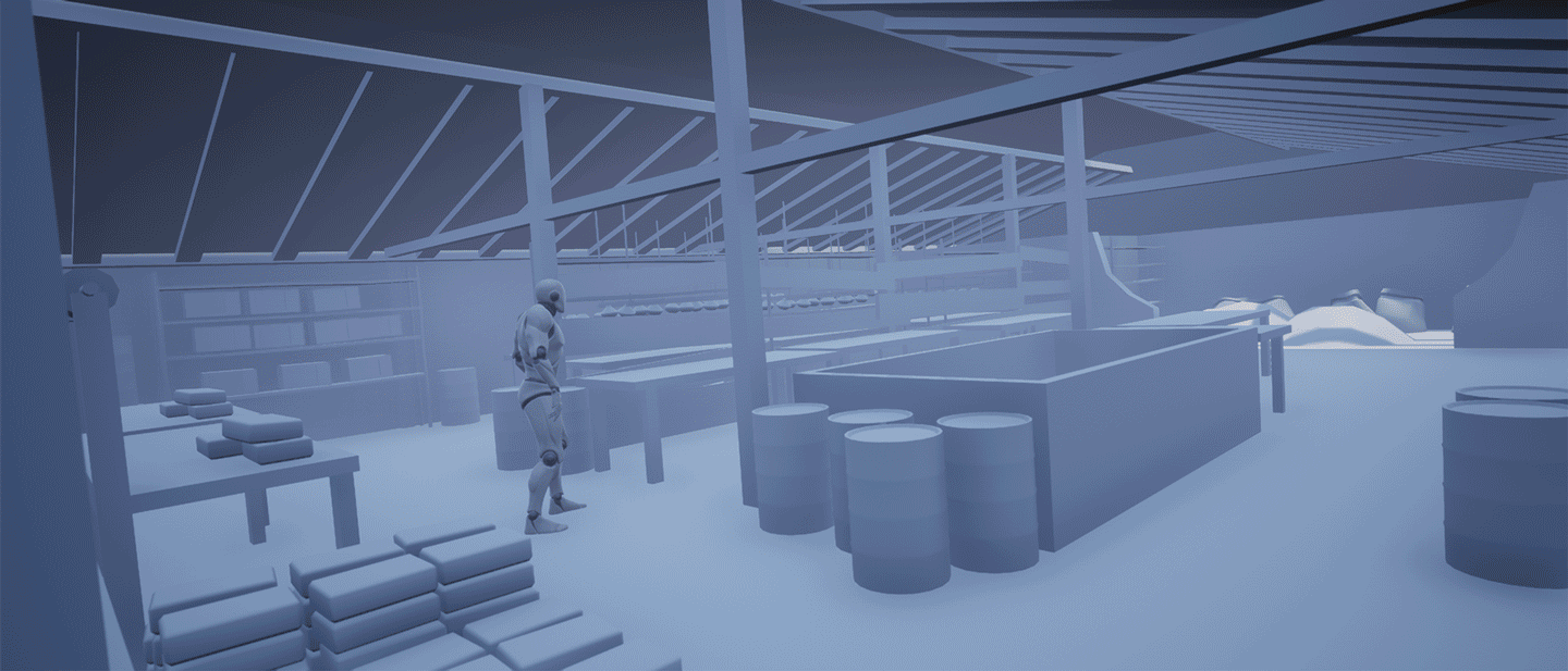
Step 6: Blockout
I already have a BSP brush blockout from the layout stage, and now I need to expand it. I'm not bothering about polycount, topology, performance or detalization now. All I care about is big/medium shapes.
This step has several goals:
1. Evaluate the amount of work needed.
2. Establish dimensions and proportions.
3. Check if props make sense within the scene.
4. Check if props work for the composition.
5. Check playability when props are present.
Modularity Planning
I did some modularity before, but not in such a big scene. So, I wanted to check first if I can pull off this environment at all.
I started with one chunk, the most common I saw in references - small window, 2x4 meters.

I tried to build as much of the level as possible with this piece. Only when I felt that the one I have is not enough, I modelled a new one. This approach helps to keep the number of chunks to a minimum. As a result, it took me 28 pieces to build everything I wanted.

28 still sounds like a lot. The reason is more complex wall shapes -niches and cylindrical towers required separate chunks. Considering many of them will share UVs and even geometry, it shouldn't be a big issue anyway.
Important Lights
Before blocking out assets, I wanted to put the principal light sources in the scene. Why now and not during the first lighting pass?
As lights are my primary tool to guide the player through the level, I wanted to check if the level design works as intended. Are lights visible from junctions? Is it clear where to go? Does light make sense in that spot?

It was a farseeing decision. Apart from a few smaller changes, I alternated a big part of a garage zone. In the first instance, I could spot the exit right after I enter the garage area.

I decided to go with the police lights on the exit. It was falling on the opposite wall creating an unusual light spot, so I thought it would be nice to make the player see it too, without turning around.

I reworked that part of the level. Now, when the player comes out of the passage, he doesn't see the exit tunnel. Instead, there is a hint that's something is going on around the corner, but he can't see it yet. It not only gives us a more appealing picture but also builds anticipation. Good for art, good for level design!
Another plus of placing important lights before assets - I don't want any props blocking the light. Now, while placing assets, I will see immediately where they can't be to keep lights visible.
Essential Assets
I was going through all my references over and over again, picking up intriguing ideas and elements to fill up my scene. All shapes and geometry are very approximate. The only two things I am worrying about now - does every prop contribute to the story/composition/atmosphere and its dimension. Nothing more.

It's crucial to find the right dimensions on this stage. It will not only affect my composition and level design but save me plenty of time later.
Also, it's the right time to create the asset list and start filling it with assets I am placing in my blockout. We will talk about it more on later stages. I haven't decided yet how this list should look. For now, it looks like that:

Terrain
It's OK to have a ground as flat as a pancake for this scene. But I want to add melted snow to indicate the time of the year, and it usually piles up near walls. So I raised a terrain along walls a bit.


Plus, it's pretty common to have the dug up ground to change water pipes or any other reason.

I thought it's another graphic tool for storytelling and added a massive pit in children zone. It should show an overseen danger which is so mundane, that nobody pays attention to it.

The Result
Here you can see how level changed comparing with the layout stage:


And here is each area overview from the top:


Update - 28 Jun 2020
Step 5: Story
Remember my layout from the previous step?

Let's talk about these zones a bit more, because the story starts there.
Garage Zone
I've seen a lot of garages on reference images, and they seemed like a suitable detail to add some variety to my scene.


The only place for the garages is the area near the exit. Because passages leading to another two areas are too narrow, cars can't get any further. I could leave garages as a purely functional thing. But, it's impossible to ignore the garage culture men had in Eastern Europe during the USSR period and the 90s.
A garage is a sacred place. The official reason to spend all your free time in a garage is repairing your cheap rubbish car. But in fact, it's not the result that's important, it's all about the process. The garage is more of a men's club. You meet with your buddies, have a drink or smoke, discuss football or complain about politics. For some men, it was a place to hide from their grumpy wives, who will yell at him for smoking too much.
I devoted the whole area to this kind of people. We won't see any of them, but there will be signs of their gatherings all over the place.
Bench Zone
Apartments in these houses are often cheap, low standard or shared. You have a pretty high risk to end up side by side with people, who won't appreciate your efforts to make your courtyard a more pleasant place to live in. It's easier to destroy than to create.


In my environment, somebody was optimistic enough to invest time and money to bring some benches and flowers. There's always this type of individuals who believes the best in people.
The sad reality is that some unscrupulous neighbours vandalized and littered this place. People try to appeal to the conscience of vandals. They set barriers and leave signs "Please keep our courtyard clean", but it hardly ever works. We will see the history of the endless fight between generosity and ignorance.
Children Zone
This area is the furthest from the exit and thus parents consider it the safest. They forbid their children to go to other areas and want them to stay in sight at all times. Sadly, the courtyard is not meant for children. There's not much to do for them, but you can always find how to entertain yourself when you are a kid. You can try to find a new place for hide-and-seek. You can make a snowman if you are lucky and snow hasn't melted since last night. You can ask your neighbour welder to make a football goal from old pipes you found. Or you can show off the bicycle you inherited from the older brother.

In this zone, we will see signs of children's imaginative mind.
The Main Story
Who would be the main character if it was a game?
What would be his story, goal and what would be the role of the environment I'm building?
It took me a lot of thinking. First, I had to throw away some pretentious sci-fi and dystopian ideas ("no sci-fi" in my goals, remember?). After that, I decided that the most logical protagonist here would be a child. But why is he outside when nobody else is? Where does he go and why?
The idea finally came to me from the film "Loveless", made by Andrey Zvyagintsev. It was nominated to every imaginable award in 2017 for the best foreign language film, so I assume you may have heard about it. It's drear (just what I need!) and even the colour palette is very similar to what I want for my environment.


The film tells us a story about a divorcing couple. They don't love each other anymore, neither they love their son. He's more of a burden now and an obstacle in front of their happy future with their new families. Of course, the boy can feel this attitude and one day he runs away. Parents don't even notice his disappearance until the next day. The rest of the film is from the parents' perspective, but it doesn't matter to us in this context. I thought that it was a good reason for the protagonist of my story to be outside.
In my imaginary game, we play for a boy named Matvey. He's eight. He lives with his grandmother in the centre of the city. His parents divorced, and none of them shows any interest in raising him. They left him to his grandmother, who lives here, in old courtyards close to the centre of the city. The grandmother is like a stranger to him. She never liked his dad and didn't approve of her daughter's marriage. Matvey is living proof of disobedience and disappointment. Their relationships have always been cold and distant. The boy has no clue why did she even agree to take him. He tried to befriend neighbour kids, but they are not getting along with Matvey very well, too. He's either bullied or defiantly ignored.
One day he waits until dusk, so the courtyard is empty, packs his most precious belongings and quietly slips outside. He's determined he's bold and educated enough to survive on his own. He thinks that everyone is happier if he disappears. These old courtyards scare Matvey to hell, especially after dark. It's a maze too easy to get lost in. Dark corners are crawling with nightmares and all accidental bypassers look like an imminent threat to him. But courtyards feel more friendly than the big wintery apartment of his grandmother. He hates its high ceilings, ancient dusty furniture and silent condemnation in the air. Nothing is scarier than feeling that you are not wanted.
What does this story give me as an artist? Mood, in the first place. More defined emotions I need to transfer. Plus, a couple of technical stuff like a camera set lower than usual, because we look with eight years old boy's eyes. Let's hope I'll manage to communicate all this through my art.
Update - 12 Jun 2020
I had to change my initial step order. It should have been Story now, but while gathering references, I've found some layout ideas, which gave me an idea for the story as well. So, I will have to do Layout first, otherwise origins of the story won't be clear.
Step 4. Layout
It all started with a couple of drone images. I sketched a quick plan and built a quick blockouts in UE4 with BSP brushes. I kept modularity in mind, so I was assembling this blockouts from 400x200x2400 blocks, which corresponds to 6 floor high piece of the wall with 2 standard windows or 1 wide window.


It took me few iterations for modular blocks to come together. Plus, I had to change overall size of the courtyard after running around with the default UE4 character. Sometimes it was too wide and didn't create any claustrophobic feeling I was after. Sometimes it was too tight and didn't allow enough movement.
It would be prudent to take one of the first two layouts to keep it simple. I sketched third layout just for fun and practice, but it stuck in my mind and started generating ideas and story before I even made a concious choice.

Here you can see how I want player to move across the level:
1. Player starts at the porch, as if he just left the building. The most noticeable thing within his field of view is a lit passage on his right.
2. When he goes out of the passage to the second area, lamp above porch on his left should draw the attention.
3. It's a dead end. He'll have to turn around to find another way.
4. While facing backward, he can notice light in the third area, visible through second passage.
5. When he enters third area, he will see clearly lit exit.
Green circles are showing the areas for players, who like to explore the level instead of making a beeline for the exit. There will be hidden small rewards for such players - extra scenes, revealing more story.
Why are there children, bench and garage zones? This is the part of a story I will tell in next step.
As usually, thank you for your time and see you soon.
Update - 10 Jun 2020
I must admit, I had to throw out "Set of features" step. Part of it was already listed in Step 1 among goals. Moreover, it's hard to think of particular features for a level, which is not intended to be playable, even though it has some basic level design ideas. Let's move to references instead.
Step 3: Reference&Research
I have 5 boards of references. The idea of it was borrowed not only from the WoLD article, but also from the video we all love and know well - ArtStation Challenge Vlogs made by Tim Simpson.
Why splitting references in 5 boards? Besides staying organized, you will save yourself a plenty of RAM. That's how much memory PureRef was eating up when I was dumping everything in one board:

I rarely need several boards at once. If I am working on individual prop, I don't need my lighting and quality benchmark boards open. So I can keep them separate and take off the load from my PC. Here is how it looks after splitting:

Board 1. Environment&Location
The difficulty of the research was that the majority of the information is about beautiful, historic and attractive for tourists courtyards. But I need the most ugly and depressing ones you have! Luckily, there is a website, which appreciates every type of courtyard. You can even find the cool map of courtyards, and, if you are lucky, Google will have some Street View right inside them. Here is the link to my list of Google Street Views, if you want to have a virtual walk yourself.
Another good source was a photographer Alexey Sergeev. His website has a huge archive of courtyards from various cities, including Petersburg.
After initial research my PureRef board looked like this:

Board 2. Props&Details
Here are some general ideas, sorted in different categories. It will be updated later, after asset list and blockout are established.

Board 3. Lighting and moodboard
There is one particular lighting I wanted to do for a while now. It was imprinted in my memories since school years, and I feel like it must be taken out of my mind.
It's November, sun sets early. It's about 4 pm and you walk home from school. It was already snowing this year, but temperature jumped back to 0°C and instead of snowy fairytale landscape you get dirty slush pushed by grumpy yardman to the sides of the road and grey puddles you carefully evade. Trees are bare and look dead. Nature is stuck in the limbo - autumn has passed, but it's not a winter yet.
It's not dark yet, you don't need streetlights to see everything around you. The moment, when landscape around you slowly turns into the row of dark, faintly discernible silhouettes, somehow eludes you. This transition is so smooth, that the realization, that you can barely see anything, always hits suddenly.
Have you ever had these bad dreams, when you turn on the lights, but still can barely see? This November dusk always reminds me these dreams. I think, that's how blindsight probably feels.
I see that type of lighting a lot in the art of the people, who grew up in post-soviet countries. I think it's stuck within all of us. Here are some examples I managed to gather:

There are 4 colour palettes I picked from different images. I'm thinking about trying them all in a first lighting pass before deciding. My favourite is pinkish-purple light, from the top row of images. In addition to depressing gloomy mood, it adds some otherworldly feeling to the image.
Board 4. Quality Benchmark
This idea is borrowed from Tim Simpson and I'm still learning how to use it properly.
The main problem appears when there is no recent games with a necessary setting and style, and you have to strain your memory to remember something that's close enough. The only thing that came to my mind was The Division. The first game had tons of great examples of environment storytelling. I haven't played The Division 2 though, but I found some artwork on ArtStation, which could serve as an example of the quality I need to reach:

The Division
Geoffroy Calis https://www.artstation.com/geoffroycalis
The Division 2
Henri Partier https://www.artstation.com/artwork/BmEY6r
Loek Gijsbertse https://www.artstation.com/loek
Luke Dawson https://www.artstation.com/lukedawson
Jeremy Estrellado https://www.artstation.com/dinusty
Personal projects
Brice Beeson https://www.artstation.com/artwork/GXk52W
Ted Mebratu https://www.artstation.com/artwork/XB3XPa
Ash Thundercliffe https://www.artstation.com/artwork/1nKR0G
Board 5. Dimensions
It turned out, that Dimensions board and Details&Props board share the same problem - it's too early to gather these references at this stage. Therefore, I had to create them for the future, to remind myself to put them in respective boards and keep in one place, instead of scattering all around.

When the project is finished, I'll update all boards to compare how they changed.
Research
I had a separate page in Notion, where I put all the little facts and details about courtyards I stumble on, which could define how it looks and add some authenticity.
These courtyards are the result of lack of space in the city. Land was expensive, because St. Petersburg, in fact, is build on the swamp. Draining it to build a house costed a fortune, therefore landowners and landlords were building houses as densily as possible to maximize the profit.
As I mentioned earlier, ventilation here is very bad. Locals believe it saves them from the cold winds, but, in fact, besides making the air stuffy, it raises the moisture. Therefore, facing of the houses degrade faster.
Some articles say that ground floor often didn't have any windows, as it was meant for household needs. However in the images I see the opposite. There are windows, but usually with a security bars. It's considered, that ground floor windows, especially inside courtyards, are perfect targets for a robbers, so they need extra security measures.

Another thing locals mention is silence. Comparing to outer streets, silence here is almos uncomfortable.
Students and locals often look for the ways to improve the conditions of the courtyards. One of the most common solutions is graffiti to add some vibrant colours. Not everybody thinks agrees it looks nice.
Some facts I already mentioned while explaining the idea, but still essential to remember:
• Courtyards are badly lit. Therefore, plants don't usually grow there.
• You can see neighbour's appartment from your window and neighbours can see yours. So on most of windows, especially on lower floors, curtains are closed.
• In many courtyards, visitors are not welcome, so locals put massive metal gate and a lock.
Thanks for reading and see you in the next part!
Update - 7 Jun 2020
Step 2: Idea
As you could guess from the title, I already knew my idea before I even started. But this step is still essential to shape, explain and define the edges and limits of my idea. To make sure it matches my goals.
World of Level Design article, which I mentioned in the previous step, breaks this step into three parts: setting, location and theme.
Setting
"Environment setting is a general, physical location of where your game environment takes place. Where does it take place? Urban or Rural? Interior or Exterior? What about time period?"
Exterior - my previous big project was interior, and I want some variety.
Urban - as we remember, modularity is the next thing I want to master.
Nowadays/near future - to avoid diving too deep into research or concepting(if it was historical or sci-fi) and keep it simpler.
Location
"Location is the actual place where your idea is set. It is a more specific place within the environment setting."
This type of courteyard is called dvory-kolodsy (дворы-колодцы) in russian, which literary means "well courtyards". They vary in sizes, but usually high buildings are standing so close to each other that you can barely see the sky above you. Feels as if you are standing on the bottom of the well. Such courtyards can be found in multiple cities in Russia and Europe (e.g. Riga and Moscow), but they became a symbol of St. Petersburg in a way.
The appearance of these courtyards was captivating my mind since my girlfriend told me about them. She used to live in such house for some time. All windows were facing courtyard and she had to sit on the floor to see a piece of sky. It felt like walls were closing in.
For some reason, her tales gave me strong vibes of beautifully disturbing and surreal "Golem", written by Gustav Meyrink. Even though all events of the book happen in Prague, it sounded exactly how I imagined the ghetto where characters lived. Here are some illustrations made by Hugo Steiner-Prag:


And, of course, that's how you imagine the setting of Dostoevsky's "Crime and Punishment". These are illustrations made by Ilya Glazunov:


Picking St. Petersburg's courtyards for my project was just a matter of time. Luckuly, it matches all of my goals perfectly.
Theme
"Theme is the subject matter of your location. It is a unifying and dominant idea that brings your environment together. Theme is more abstract such as a particular design style, time of day, time in history, weather, atmosphere, mood, feeling or an event."
Claustrofobia, depression, paranoia and hostility.
I've read number of impressions from people who lives or used to live in these courtyards, to understand how person may feel there. Actually, the experiences are very different. Some people have happy nostalgic memories, some people are comfortable there and prefer it to dull apartment buildings of 60s or 70s. I was cherry-picking negative experiences only, to support the mood of my scene.
Inhabitants explain their experience as "living in a chest". They feel trapped. A very little light gets there. Because of that, plants doesn't usually grow there. Stuffy air. You can't feel the wind blowing from the river or bay, which is good. But at the same time, it never feels fresh. Silence is so thick that it gets uncomofrtable. Perfect conditions to develop a mental illness.
In such tight spaces you feel like you are always watched. You have to cover your windows and hide in the depth of your flat to stay away from curious neighbour's eyes. It doesn't stop junkies and drunkards from coming turning the courtyard in a dump. Tourists tend to be annoying too. Locals put a big metal gates with a lock, limiting the access to the courtyard to keep unwanted guests away. They still tend to sneak in. Every new face encounters suspicion and mistrust, regardless of their intentions.
These are the feelings I'll need to convey through my environment.
Update - 7 Jun 2020
Before we start
After finishing my "All gone" piece and my interlude "Ramen Shop", surge of dopamine demanded a new project immediately. This time, I want to share with you all the process, from very first step to publishing. I hope you find something useful and interesting here. All comments and critique are very welcome.
First of all, to keep myself focused and motivated, I need a good plan. A roadmap. If I ever get lost (which, sadly, happened too often), I can just open it and be back on track. For this purpose, I assembled a quick list of 11 steps, which is, in fact, this article lighthly adjusted to my needs:
1. Goals
2. Idea
3. Set of features
4. Reference & research
5. Story
6. Layout
7. Blockout
8. Focal points
9. Visual development
10. First lighting pass
11. Lists
12. Possible issues/solutions
I will explain each step as we go.
Step 1. Goals
Before going any further, I need to ask myself a few questions:
Why am I doing this project?
What do I want others to see?
What do I want to learn as a result?
So, these reflections together with several articles, Q&A sessions and conversations with other professionals led me to this extensive list of requirements:
• Playable level and not just screenshots
I am doing a game environment, not film or illustration, which means I need to think in 3D in the first place and not in 2D. Plus, I've heard that this kind of portfolio piece looks more attractive to recruiters.
• Optimization
As a part of the previous goal, my level should be running at 30 FPS at least, ideally - 60 FPS. This will require deeper optimization knowledge.
• 2k textures for tileable textures/trim sheets; 1k for individual props
It sounds like a terrible limitation to me, but that's what some of the recent games use. And I should gather all my creativity and skills to make it look good under these limits.
• Basic level design
Think about how player will be moving through level. How to use environment to make player move the way I want him to move?
• Modularity
Extremely useful and essential technique I didn't have enough experience with. It's a gap in my knowledge I want to cover.
• Lighting/atmosphere focused
Because that's what I value the most in games. That's why I love and play them, and that would be an omission not to translate it through my work.
• Reuse/take ready textures/props as much as possible
As much as I heard from other Environment Artist, you don't always have to create your textures from scratch. Adjusting ready textures and using it right is also a skill. So, Megascans and textures.com are my best friends. If there is nothing - there's always Substance Designer.
• At least one animated part, e.g. cloth in a wind, piece of wire swinging, birds, etc.
It makes your scene alive! In every environment video I saw, moving pieces always catch my attention and look good.
• Something wet and reflective
Have you heard about wet-down in cinema?
The crew sprays water on asphalt because it looks better and reflects lights beautifully. Why not stealing this little trick to my scene either?
• Affordable!
I always tend to get too ambitious with my scenes. I need to keep that in mind and manage to stop myself when my geyser of chaotic ideas erupts again. The main purpose of all that is to complete the scene, not making it super-unique and not like the others.
Thanks for reading!


Comments (0)
This project doesn't have any comments yet.